
A well-planned example of clinical medical signage begins even before the waiting room. A person arriving for a consultation, a blood draw, or a specialist appointment should be able to spot the entrance, understand where to check in, and find the right room without having to ask for directions at every step. In a healthcare setting, this clarity reduces delays, protects confidentiality, and supports the work of staff.
Signage is therefore not a simple decorative addition. It is part of the welcome experience and day-to-day organization. For a family medicine clinic, a dental clinic, an imaging centre, or a family medicine group (GMF), the right combination includes exterior signage, door identification, directional indicators, and practical information. Each element must be legible, durable, and consistent with the facility's image.
An example of signage for a medical clinic
Imagine a clinic located in a multi-storey professional building. Outside, a sign clearly identifies the clinic from the parking lot or sidewalk. At the building entrance, a directional plaque indicates the floor and suite number. Once on the floor, a wall panel confirms arrival at the right place, displaying the clinic's name, logo, and hours of operation.
In the reception area, a discreet display presents useful instructions: checking in at the front desk, mask or health measures when applicable, payment, documents to have ready, and the procedure in case of a late arrival. A directional panel then leads to the consultation rooms, the blood draw room, the washrooms, and the exit. Doors bear uniformly labelled plaques: "Room 1," "Room 2," "Administrative Office," or "Staff Only."
This example works because it guides a person through their visit in the actual order it unfolds. It does not attempt to display all information in the same place. Good signage provides the right cue at the moment it becomes necessary.
Priority areas to identify
The first area to address is exterior access. The clinic's name, address, or unit number must be visible according to the reading distance. A facade sign does not have the same requirements as a door plaque: the former must be noticeable from a distance, while the latter must be precise at close range.
Next comes the reception area. This is the ideal place to establish traffic flow rules and address recurring questions without overburdening the front desk. An engraved plaque, a printed acrylic panel, or Lamicoid wall signage can present essential information with a professional finish. When a single counter serves patients across multiple services, identifying the queues or stations prevents many misunderstandings.
Hallways and intersections call for simple directional indicators. An arrow, a pictogram, and a short label are often more effective than a lengthy text. Indicators can be mounted on the wall, suspended from the ceiling, or placed on panels depending on the layout of the space. The choice depends on available sightlines, ceiling height, and the building's constraints.
Finally, doors must be clearly identified. Custom door plates make it possible to include a professional's name, a room number, a function, or a pictogram. In a clinic where offices sometimes change occupants, an insert plate or an interchangeable solution may be more practical than permanent engraving. Conversely, technical areas, restricted access points, and fixed rooms benefit from durable identification.Readability: The Primary Production Criterion
Elegant signage that is hard to read does not serve its purpose. The font must remain sharp, large enough, and easy to distinguish. Contrast matters just as much: dark text on a light background, or the reverse, is generally more effective than a combination of similar shades. Glossy finishes can be attractive, but they sometimes produce glare under clinical lighting.
Content also deserves to be kept concise. "Blood draw room" is faster to understand than "Room reserved for blood sample collection." Similarly, pictograms for washrooms, accessibility, exits, or restricted access make it easier for people of all ages and different languages to find their way.
In a Quebec context, French must be handled with care, particularly in medical terms, directions, and instructions. If the clientele warrants a bilingual presentation, space should be planned for from the outset. Adding a second language to a format that is already too crowded often reduces readability. A structured layout, with a clear hierarchy between the two languages, yields a more functional result.
Confidentiality and Tone of Messaging
Medical signage must inform without unnecessarily exposing patients. For example, displaying appointment lists, diagnoses, or indications that reveal the specific nature of a consultation should be avoided. Room numbers, service categories, and general instructions are preferable to overly detailed messages.
Tone also matters. A message such as "Please check in at the reception desk" is welcoming and direct. "Restricted to authorized personnel" sets a boundary without being aggressive. Necessary rules can be firm, but their wording must remain appropriate for a care setting where visitors may be anxious, pressed for time, or in a vulnerable situation.
Materials Suited to Clinical Use
The material is chosen based on the location, the required maintenance, and the desired level of permanence. Engraved Lamicoid is a common solution for door plates, room numbers, and technical identification. It offers lasting contrast and comes in several colours and thicknesses. CNC engraving allows for precise text, numbers, and symbols, which is particularly useful for producing uniform series of plates.
Acrylic works well for welcome panels, wall displays, and information boards. It can be printed, engraved, or mounted with standoffs for a more polished look. Engraved or printed metal is a solid choice for exterior identification, institutional plaques, or areas subject to frequent handling. For certain temporary or evolving needs, vinyl applied to an existing surface offers a flexible solution, provided the finish and adhesion are suited to the location.
In a clinic, surfaces must withstand regular cleaning. Overly complex textures, fragile materials, or hard-to-reach fasteners can complicate maintenance. The disinfectants used on-site also need to be taken into account. A material that looks right on paper can turn out to be a poor choice if its finish deteriorates after a few months of intensive cleaning.
Designing a cohesive system rather than a series of panels
The best results come from a repeated visual system. Consistent colours, pictograms, plaque formats, and typographic rules create immediate reference points. A consultation room, a treatment room, and an administrative office don't need to look identical, but they should belong to the same visual family.
Before production, it's helpful to walk through the space as a new patient would. Where do they park? Which door do they use? Where do they hesitate? This kind of observation often reveals weak points: a room that's hard to see from the elevator, a reception desk hidden behind a door, two corridors that look alike, or a washroom that's difficult to locate.
A signage plan can also anticipate future changes. A clinic that adds practitioners, modifies its services, or shares its space with other tenants should favour elements that are easy to update. This flexibility may come with a higher upfront cost, but it avoids having to redo all the signage with every reorganization.
Having custom plaques and panels produced
To move from plan to production, you'll need to provide final text, desired dimensions, logos, colours, and installation constraints. Photos of the site and a sketch of the intended locations help determine a realistic format. Graphic design can then bring the elements together, while laser engraving, CNC engraving, printing, and screen printing each address different finishing and quantity requirements.
Mr. Trophy supports organizations looking for custom plaques, interior signage, and engraved products tailored to their space. For a clinic, grouping door plaques, directional panels, counter identification, and institutional displays into a single order helps maintain a consistent look throughout.
Effective signage doesn't try to grab attention at all costs. It reassures because it clearly answers the patient's next question: am I in the right place, where do I go from here, and who can I speak with?
You may also like
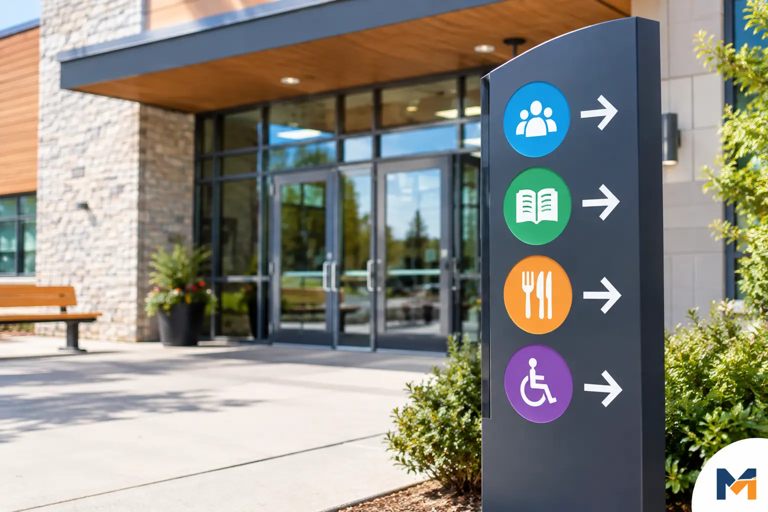
Community Centre Signage Example
An example of community centre signage to guide visitors: access, rooms, security, and durable, clear, personalized plaques.

Example of sports equipment marking
Discover an example of durable sports equipment marking: methods, materials, and tips to identify your teams and sports facilities.

Où placer logo uniforme sur un vêtement?
Découvrez où placer logo uniforme pour une visibilité nette, un marquage durable et une tenue cohérente pour vos équipes, clubs et événements au Canada.