A team arrives on the field, at the counter, or at an event in brand-new uniforms. The logo is crisp, the colours are exact, but it gets lost under a zipper, disappears when a jacket is worn open, or becomes unreadable from a distance. The question of "where to place a logo on a uniform" isn't just about aesthetics. It determines your organization's visibility, the garment's comfort, and the perceived quality of your image.
Whether for a sports club, a school, a municipality, a business, or an organization, the right placement depends on how the uniform is actually used. A work shirt, a front-desk polo, a team jacket, and a promotional t-shirt don't share the same function. Before choosing a branding area, you need to know who needs to recognize your logo, from what distance, and under what conditions.
Where to Place a Logo on a Uniform Based on Garment Use
The most appropriate placement often comes down to a simple question: should the uniform identify the wearer, promote the organization to the public, or do both? A logo meant to reassure a customer looking for an employee isn't positioned the same way as one designed to be seen from the bleachers.
The Left Chest: The Versatile Choice
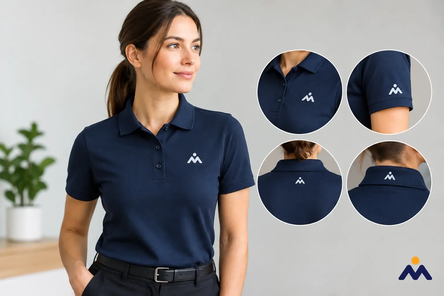
The left chest is the classic placement for polos, dress shirts, light jackets, hoodies, and custom corporate apparel. Located close to the heart, it offers a subtle, professional, and instantly recognizable presentation up close. It's often the best choice for retail employees, administrative teams, event staff, and volunteers.
This area is particularly well-suited for horizontal or compact logos. It also leaves room for a name, job title, or identification element on the opposite side of the chest, if needed. However, you must take seams, pockets, buttons, and zippers into account. A graphic that is too wide on a zippered jacket can look cut off or off-centre when worn.
The Right Chest: Useful for Complementary Identification
The right chest works well when the logo already takes up the left side, or when a garment includes a pocket, patch, or specific identification. It is often used for a person's name, role, department number, or secondary brand.
For a public-facing team, this layout can be highly effective: the organization's logo on the left, and the first name or position on the right. This setup helps facilitate interactions without cluttering the uniform. Readability should remain a top priority, especially with thin fonts or small text.
The Sleeve: A Visible Signature in Motion
A logo on the sleeve offers a modern, sleek look, particularly on polos, jackets, t-shirts, and sportswear. This placement works well for a secondary logo, partner logo, association, or one-off campaign. It leaves the chest free for the primary branding or name.
However, the sleeve offers a narrower and slightly curved surface. Very fine details don't hold up as well visually. A simplified logo, a monogram, or a short word will generally be more effective than a complex graphic. You should also consider whether sleeves are often rolled up, covered by a safety vest, or hidden under a coat.
The back: to be recognized from a distance
The upper back is the best area when you need to be seen from afar. It’s a great choice for field crews, outdoor events, coaches, volunteers, maintenance or delivery staff, and sports teams. A larger logo, accompanied by the organization's name, remains visible in a crowd, at an event site, or in an arena.
The trade-off is clear: the back doesn't replace front branding for greetings or direct contact. Someone facing a customer should be identifiable without having to turn around. In many projects, combining a small chest logo with a large graphic on the back provides the best balance between personal interaction and visibility.
Other areas: use with intention
The center chest is well suited for promotional t-shirts, sports uniforms, and apparel designed to make a bolder statement. It immediately catches the eye, but may feel less formal for office or service attire. The back of the neck, lower back, and hem can feature a small additional mark, provided the essential information appears elsewhere.
Avoid choosing a placement simply because it’s original. On a uniform, every mark should serve a purpose: to identify, guide, promote, or distinguish a role.
Adapting the logo to the cut and material
The exact same logo won't behave the same way on heavy cotton, a piqué polo, a waterproof jacket, or high-visibility clothing. Fabric texture, stretch, seams, and background color all affect the final rendering. Precise branding on a flat surface can lose its sharpness on a stretchy sleeve or a heavily textured area.
Before production, it’s helpful to confirm the graphic's size on the exact garment style selected. A logo that looks subtle on an adult size can become overwhelming on a smaller size. Conversely, a logo sized for a lightweight jacket may look too small on a winter coat. For orders featuring multiple sizes or styles, a placement proof prevents any surprises.
Color also deserves special attention. On a dark garment, a dark logo risks lacking contrast. On light fabric, very pale elements can disappear. Adapting the color, monochrome, or inverted version of your logo ensures sharp legibility without altering your visual identity.
The branding method influences placement
Choosing between screen printing, textile printing, or another customization method depends on the garment, design, quantity, and desired level of detail. A large area on the back and a small chest logo don't always require the same treatment. That’s why it’s best to decide on the placement before finalizing the branding method.
Screen printing is particularly well-suited for bold visuals, crisp colors, and runs of uniforms or promotional apparel. For a logo with fine lines, small text, or gradients, the file needs to be carefully checked. Graphic design may sometimes require adapting the logo—without altering its identity—to better fit the limitations of the fabric and the chosen area.
Maintenance also needs to be considered. A uniform worn every day, washed frequently, or used outdoors should feature branding tailored to its level of use. The best placement is one that remains clear, readable, and durable through washes and movement.
Creating a Clear Hierarchy on the Uniform
A single garment can feature an organization logo, team name, number, sponsor, and staff member's first name. Without a hierarchy, the overall look becomes cluttered. People should be able to quickly see who you are, then identify the secondary information.
In most projects, the main identity should occupy the most natural area: left chest or upper back. Partners or divisions can be placed on the sleeve, while individual names can go on the opposite chest or back, depending on the type of uniform. For a sports league, association rules or sponsor requirements may also guide the decision.
This consistency becomes even more useful when the apparel package includes several items: t-shirts, polos, jackets, caps, and bags. The logo doesn't need to appear in the exact same spot on every product, but it must maintain a recognizable size, color, and presence. A well-coordinated collection inspires confidence and simplifies future orders.
Preparing Your Custom Apparel Order
To get an accurate recommendation, gather your logo in the best available format, your organization's colors, the type of garment, quantities, and your required date. Also indicate whether the uniform is intended for indoor work, an event, sports, or outdoor activities. These details help us suggest a realistic branding format and placement that respects the cut of the product.
A visual proof before production is especially helpful when your order includes multiple locations or individual names. Check spelling, alignment, contrast, and position relative to pockets and seams. Once the garments are decorated, these elements cannot be easily corrected.
At Mr Trophée, custom apparel and promotional clothing projects can include artwork preparation tailored to your chosen product, whether for a team, business, or community event.
Good placement isn't about filling every available space. It allows your logo to remain clear, effective, and true to your organization, even after a full workday, a tournament, or an entire season.
You may also like
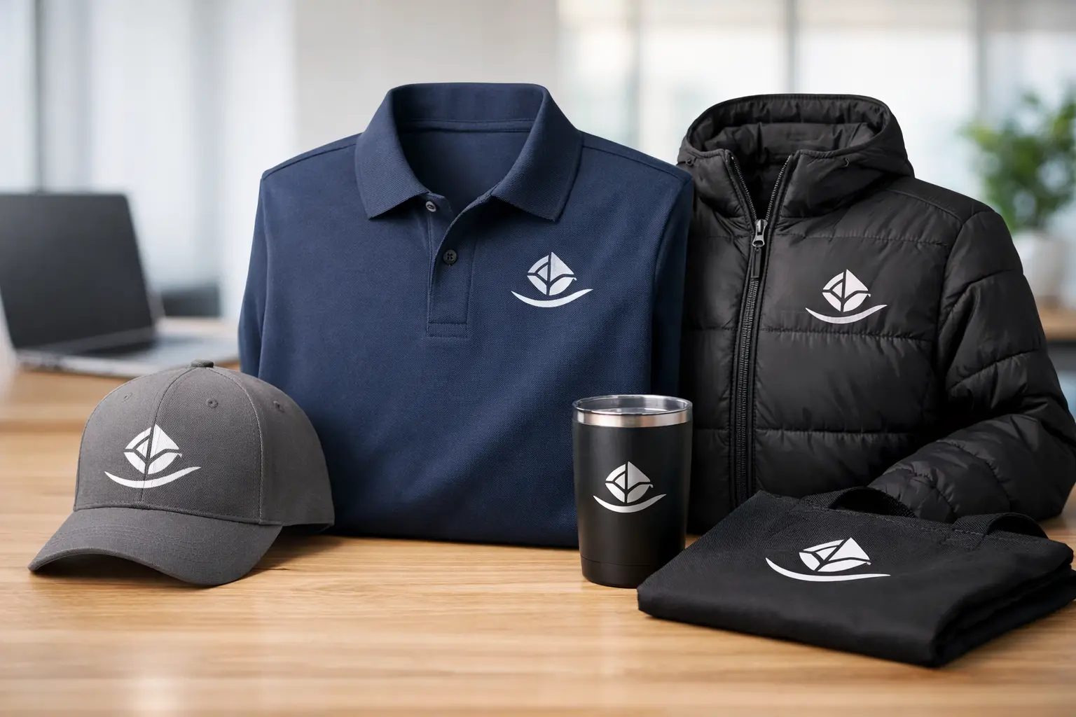
Custom Corporate Clothing with Logo
Custom logo corporate apparel strengthens your image with teams and clients, from job sites to events, for your key activities.

Custom Medals from Your Drawing or Logo at the Best Price
Have a logo, a sketch or a child's drawing? Mr Trophée turns it into a one-of-a-kind custom medal at the best price guaranteed in Canada.
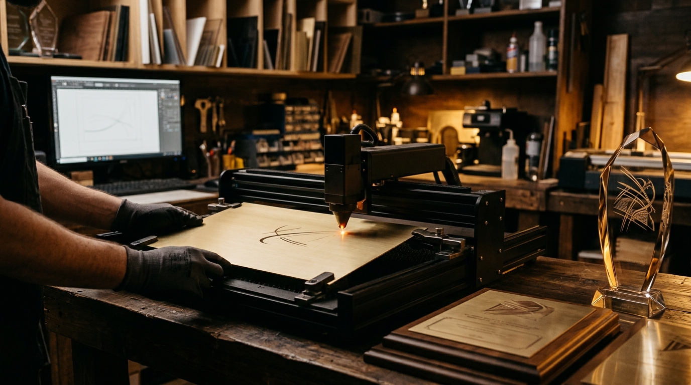
Preparing Your Logo for Laser Engraving and Printing: File Formats and Best Practices
A good file is half of a great trophy. Here are the formats, resolutions and tips to know so your logo looks sharp on your plaques, trophies and medals.