A person looking for the boardroom shouldn't have to interrupt a meeting, consult three contradictory signs, or ask for directions at the front desk. Knowing how to identify meeting rooms is a matter of wayfinding, but also of image, confidentiality, and day-to-day efficiency. In a school, a municipal office, a business, or a community organization, well-thought-out signage makes getting around easier from the moment you walk in.
Making the right choice isn't simply a matter of putting a name on a door. You need to select a legible format, a material suited to the space, a reliable installation method, and customization that aligns with the organization's identity. An engraved plaque, a directional sign, and a room booking system may also need to work together.
Start with the function of each room
Before producing any signage, establish an accurate list of the spaces that need to be identified. A meeting room may be used for management meetings, human resources interviews, training sessions, video calls, or parent-teacher meetings. The name displayed should help visitors understand where to go, without creating any ambiguity.
The most straightforward names tend to work best in institutional settings: Board Room, Training Room, Room 101, or Multi-Purpose Room. They remain easy to understand for new employees, guests, and vendors. In environments where several rooms look similar, numbering should follow a clear logic, ideally tied to the floor, wing, or section of the building.
A themed name can also be appropriate. Rooms named after neighbourhoods, waterways, local figures, or organizational values add character to a space. This option does, however, require more rigorous directional signage. Someone looking for "Boréal" needs to be able to quickly identify that it's a meeting room, which floor it's on, and how to get there.
For confidential spaces, avoid names that reveal too much information. "Private Room" or "Interview Room" may be preferable to wording that exposes the subject of a meeting. The level of discretion required depends on your activities and the amount of foot traffic in your hallways.
How to identify meeting rooms with consistency
Door identification is the starting point, but it isn't always enough. In a multi-storey building, a visitor needs to be guided from the entrance all the way to the right room. Consistency between door plaques, directories, directional panels, and room booking displays eliminates hesitation.
Start by establishing a visual hierarchy. The room name should be the primary element. Its number, capacity, or available equipment can appear as secondary information, in a smaller font size. For example, a plaque might read "Board Room," followed by "14 people | video conferencing." This detail is useful for employees booking a room based on group size or the tools they need.
Colours should aid wayfinding, not complicate it. If each floor has a distinct colour, carry it through on your plaques and panels in a measured way. Contrast remains the priority: light text on a pale background, or dark lettering on a glossy surface, can become difficult to read depending on the lighting. A graphic mockup makes it possible to verify the balance before production.
The organization's visual identity can be incorporated through a logo, a corporate colour, or a pictogram. There is no need to overload every plaque. In many cases, a discreet logo and consistent typography produce a more professional result than an overly busy design. For a school, a municipality, or an association, this continuity also reinforces the impression of a well-organized space.
Choosing the Right Type of Plaque
The material influences the appearance, durability, and maintenance of your signage. The choice depends on foot traffic, the style of the space, the budget, and how frequently the information is likely to change.
Engraved Lamicoid is a practical solution for doors, offices, and service areas. It is available in a variety of colour combinations and offers clean readability thanks to engraved lettering. It is a common choice when you need a lightweight, durable plaque that can easily be reproduced identically throughout an entire building.
Aluminum or other metals work well in contemporary, institutional, or industrial environments. An engraved metal plaque brings a more formal presence and holds up well under regular use. It may be the right fit for a boardroom, executive offices, or spaces that frequently welcome external partners.
Acrylic is appealing for a modern finish, particularly when mounted with standoffs. It creates a sense of depth and pairs well with current office décor. That said, glare and visible smudges should be taken into account depending on the colour chosen and exposure to light.
Wood, glass, or composite materials can support a more distinctive concept. They are especially well-suited to hotels, convention centres, professional firms, or cultural venues. Their maintenance requirements and mounting methods should be evaluated from the outset. A beautiful material is only useful if it remains legible and stable over time.
Planning for Changes Without Redoing All the Signage
Some rooms keep the same function for years. Others change names following a move, a reorganization, or a partnership. In that context, a fixed plaque is not always the best investment.
Insert plaques allow you to replace only the printed or engraved strip that contains the name. They are well-suited to shared offices, multipurpose rooms, and spaces whose occupants change frequently. Interchangeable signage is also useful when a room needs to be indicated as available, occupied, or reserved.
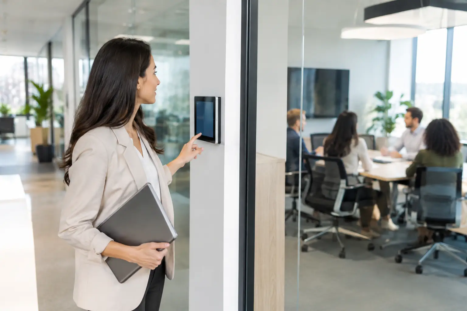
For organizations that use booking software, digital displays can be considered near the most in-demand rooms. They can show schedules and availability. However, they are not a replacement for permanent identification: the room name must remain clear even if the screen is off, malfunctioning, or difficult to read from a distance.
Combining both approaches is often the right call. A durable engraved plaque confirms the room name, while an interchangeable insert or a screen displays current occupancy. This combination keeps replacement costs down and makes space usage more seamless.
Don't overlook accessibility and readability
A well-identified room should be easy to find for as many people as possible. Choose simple, sufficiently large characters with strong contrast. Highly decorative fonts may align with a brand image, but they slow down reading when someone is moving quickly through a hallway.
Installation height should remain consistent from one door to the next. A plaque placed at a predictable location is easier to find. Avoid positioning it behind an open door, a display stand, a plant, or a decorative element. Directional signs should be installed at decision points: entrances, elevators, hallway intersections, and floor changes.
Depending on the type of facility and applicable requirements, adding braille and tactile characters may be necessary or strongly recommended. This decision should be planned at the same time as the choice of formats and materials. Accessible signage must be integrated into the project from the start, not added at the last minute to just a few doors.
Pictograms can complement text for washrooms, elevators, exits, or common areas. For a meeting room, they can indicate videoconferencing capability, accessibility, capacity, or the presence of a whiteboard. Their role is to speed up comprehension, without replacing a clear name.
Plan for fabrication and installation from the mockup stage
A successful series of plaques depends on accurate information: correct spelling of names, room numbers, up-to-date logo, approved colours, and available surface dimensions. An error repeated across twenty doors costs more to fix than a careful review before production.
Prepare a spreadsheet indicating, for each location, the final text, material, dimensions, and preferred mounting method. Adhesive mounting may work well for several lightweight plaques on smooth doors. Screws, standoffs, or other mechanical fasteners are often preferable for heavier signage, textured surfaces, or permanent installations.
A specialist in engraving, signage, and graphic design can tailor production to your requirements: engraved Lamicoid plaques, metal, acrylic, laser marking, logo reproduction, and matching series. At Mr. Trophy, this approach makes it possible to coordinate door plaques with other identification needs, such as name plates, signs, and recognition items.
Before confirming a large order, request a mock-up or visual sample. Check legibility from a few metres away, the colour under actual lighting conditions, and the text placement on the door. Meeting room signage is a subtle detail when done right, but it quickly becomes an annoyance when it isn't. Take the time to establish a clear system: it will serve your visitors and your teams at every meeting.
You may also like

Trophies and Medals for a Dance, Gymnastics or Figure Skating Competition: A Guide for Clubs
Year-end show or regional competition: here is how to choose medals, trophies and plaques that make every young athlete shine. A practical guide for dance, gymnastics and figure skating clubs.

How to Plan an Employee Recognition Day That Lands
Plan an employee recognition day that lands: lock the date, budget and name list, choose the award mix, and build a presentation flow that works.

Guide commande bannières sportives pour clubs
Ce guide commande bannières sportives aide écoles, ligues et clubs à choisir formats, tissus, visuels et délais pour une commande nette et durable partout.