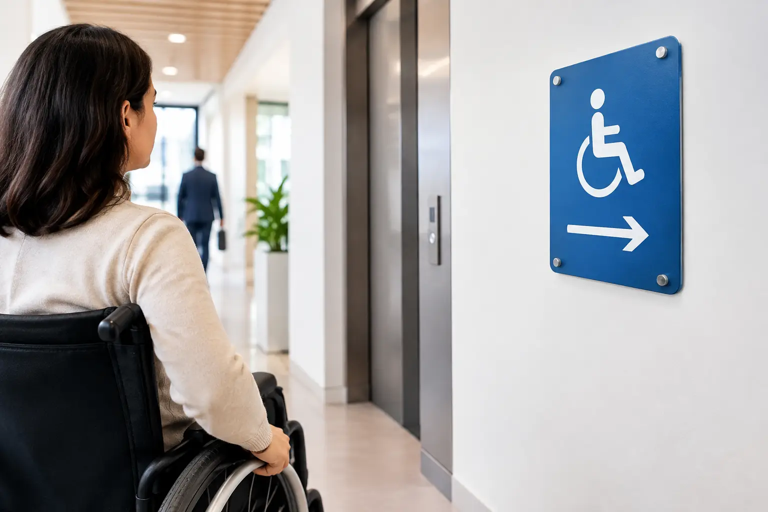
In a municipal building, a school, a clinic or a sports centre, a poorly placed sign can turn simple information into an obstacle. Installing accessible signage is not just about adding braille or a pictogram: it means creating landmarks that visitors can see, read, understand and reach independently.
For Quebec and Canadian organizations, well-designed signage supports welcoming visitors, safety and a professional image all at once. It reduces wayfinding requests at the front desk, makes it easier to move through busy spaces and gives every person clear directions, whether they live with a visual, hearing, cognitive or motor limitation, temporary or permanent.
Start with visitors' actual paths
Before choosing a material, you need to observe the building as someone discovering it for the first time would. Where do they enter? What route must they follow to reach reception, washrooms, elevators, exits or a specific room? At what point do they need to make a decision?
This review of visitor paths makes it possible to distinguish two functions. Directional signage indicates a route, for example toward reception or change rooms. Identification signage confirms that the person has arrived at the right place: room number, service name, accessible washroom, exit door or meeting room.
An overly busy plan is rarely useful. It is better to place a sign at the moment it becomes necessary, then repeat the landmark at key intersections. In a sports complex, for example, visitors should be able to find the gymnasium, washrooms and registration area without having to interpret a series of contradictory arrows.
Identify the areas that require the most attention
Entrances, corridors, intersections, stairwells, elevators and service doors are a priority. Waiting areas and counters also deserve clear identification, particularly in clinics, schools and administrative offices where visitors do not always know the layout.
Emergency signage requires separate attention. Exits, evacuation routes, safety equipment and instructions must remain visible in low light, high traffic or stressful conditions. In these cases, aesthetics must never compromise legibility.
Installing accessible signage: essential criteria
Accessibility comes down to the details of fabrication and installation. A sign may be very well designed graphically, yet lose its usefulness if it is hidden behind an open door, exposed to intense glare or mounted out of reach.
Contrast, lettering and pictograms
The contrast between text and background is one of the first criteria to check. Light lettering on a pale background, a highly polished metallic finish or a brand colour used without adaptation can be difficult to read. Strong contrast improves legibility both at a distance and up close.
Characters must remain simple and large enough based on the reading distance. Decorative fonts, all-caps text, and overcrowded information require more effort to read. Standardized pictograms, paired with clear text where needed, speed up comprehension for diverse audiences and in bilingual spaces.
Colour can help structure a wayfinding system, particularly by floor or by zone. However, it should not be the only means of conveying a message. A person who has difficulty distinguishing certain colours must still be able to understand the information through text, symbols, or shapes.
Tactile Relief and Braille
For permanent identification signs, tactile relief and braille may be required depending on the use of the space and applicable regulations. Raised text must be sharp, durable, and pleasant to the touch. Braille must be accurately transcribed and properly positioned to be genuinely usable.
Engraved or machined signs in materials such as Lamicoid are a practical solution for this application. CNC engraving and laser engraving make it possible to produce precise characters, pictograms, and tactile elements suited to the chosen format. The material, thickness, and finish must be selected based on the environment: interior use, humidity, frequent cleaning, exposure to impact, or high foot traffic.
Braille is not a decoration added at the last minute. It must be part of the production order from the design stage, with careful validation of French and English text, room numbers, and service designations.
Height, Placement, and Clearance
A sign mounted directly on a door can become inaccessible when that door is open. In many cases, identification is better placed on the adjacent wall, on the handle side, at a consistent and accessible height from one room to the next. This consistency helps visitors know where to look.
Physical obstructions must also be avoided: furniture, plants, dispensers, display stands, swinging doors, and queuing areas. The sign must be approachable without encroaching on essential circulation paths. In narrow corridors, a sign that protrudes too far can create a collision hazard.
Height and clearance requirements may vary depending on the type of building, the work carried out, and the applicable regulations. An on-site survey, supported by the facility's plans and project requirements, helps avoid ordering unsuitable formats or mounting hardware.
Choosing a Material Suited to the Space
The choice of substrate influences the lifespan, maintenance, and perception of the building. In an office setting, a simple engraved plate can complement a professional reception area. In a school or arena, a more impact-resistant solution that can withstand humidity and repeated cleaning is often the better choice.
Lamicoid is commonly used for door plates, room numbers, equipment identification and interior directional panels. Available in several colour combinations, it offers lasting contrast after engraving. Acrylic may suit more contemporary presentations, while aluminum and other metals are popular in institutional or industrial environments.
The finish should also be evaluated. A highly glossy material can reflect overhead lighting and windows. A matte or satin surface is often more comfortable to read. For outdoor use, UV rays, rain, frost, temperature variations and appropriate fastening methods must all be taken into consideration.
Planning for bilingual signage from the start
In Quebec, many organizations welcome both French-speaking and English-speaking visitors. Planning for both languages from the outset avoids improvised additions and maintains a consistent presentation. The challenge lies in preserving a clear hierarchy without overcrowding the panel.
Pictograms reduce the amount of text, but they do not always replace a precise designation. A multipurpose room, an administrative office or a laboratory benefits from being identified with straightforward wording, then translated as needed. Names, room numbers and hours of service should also be easy to update when the organization changes.
For facilities likely to evolve over time, systems with replaceable inserts or individual plates may be more cost-effective in the long run. Conversely, for a permanent designation such as an exit, a washroom or a mechanical room, a fixed engraved plate is generally more appropriate.
Avoiding the most costly installation mistakes
The most common mistakes do not necessarily come from the manufacturing process. They arise when signage is ordered without a complete inventory, without text validation or without an on-site visit. A plate may then bear the wrong room number, be installed on the wrong side or fail to match the final furnishings and colours.
A simple approach is to prepare a table listing the panel code, its text, languages, dimensions, material, precise location and fastening method. Photos of the walls or doors, along with measurements, also help confirm choices before production begins.
Visual consistency matters as much as practical compliance. Consistent arrow formats, consistent vocabulary, consistent contrast levels and a consistent numbering logic: these details give visitors confidence in the system. Cohesive signage prevents each panel from becoming a new puzzle to solve.
Working with a manufacturer who understands production
An accessible signage project often requires several types of products: door plates, directional panels, room numbers, pictograms, engraved equipment plates and temporary identifications for an event. Centralizing design and production makes it easier to maintain consistency in colours, wording and formats.
At Mr Trophée, laser engraving, CNC engraving, graphic design and Lamicoid products make it possible to prepare solutions tailored to the needs of a school, a municipality, a business or an association. The best approach is to provide floor plans, room lists, installation constraints and timelines from the start. This allows dimensions, materials and information to be confirmed before the signs go into production.
A good sign should never make a visitor guess where to go. By carefully preparing the text, locations and materials, your facility can offer landmarks that are durable, easy to read and respectful of everyone who walks through its doors.
You may also like

Engraving Errors That Ruin Award Plates and How to Catch Them
Misspelled names, missing French accents and logos without vector outlines ruin award plates. Run this pre-production proofing check before engraving.

Trophies and Medals for a Dance, Gymnastics or Figure Skating Competition: A Guide for Clubs
Year-end show or regional competition: here is how to choose medals, trophies and plaques that make every young athlete shine. A practical guide for dance, gymnastics and figure skating clubs.

How to Plan an Employee Recognition Day That Lands
Plan an employee recognition day that lands: lock the date, budget and name list, choose the award mix, and build a presentation flow that works.