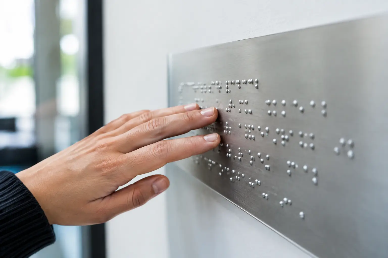
A meeting room door, a washroom, or a service counter should never rely solely on a visual cue. For someone who is blind or has low vision, Braille signage provides concrete information right where it's needed: it confirms the destination, supports independence, and reduces hesitation in a busy building.
For a school, a municipality, a business, a clinic, a sports centre, or a community organization, this type of signage is part of a well-thought-out identification system. It's not simply a matter of adding a few raised dots to a sign. The choice of text, material, contrast, placement, and manufacturing process directly affects the readability and the lifespan of the product.
What is Braille signage used for?
Braille signage conveys information through touch. It is generally combined with raised characters, so that the information is accessible both to people who read Braille and to those who rely on tactile or visual cues.
In buildings open to the public, it is used primarily to identify fixed locations: washrooms, exits, elevators, stairways, rooms, offices, change rooms, or reception areas. It can also indicate a floor number, a direction, or a specific function. Its purpose is to be found and understood quickly, without requiring the person to ask for assistance.
This distinction is useful during the planning stage. A door sign with Braille meets a stable identification need. A temporary sign for a tournament, a fundraiser, or a ceremony calls for a different signage solution. Both can share the organization's colours and logo, but their production requirements are not the same.
Where to plan for tactile signs in a facility?
The best time to define locations is before ordering the signs, ideally during a review of the signage plan or during a renovation project. A consistent series often costs less and avoids style inconsistencies between departments, floors, or buildings.
Start with access points and essential spaces. Washroom doors, permanent rooms, exits, stairways, and elevators are typically the priority. In a school, administrative offices, student services, and specialized spaces are often added. In an arena or community centre, change rooms, offices, multipurpose rooms, and staff-only areas may also require clear tactile identification.
Placement deserves as much attention as content. A sign mounted directly on a door becomes difficult to locate when the door is open. A sign placed too high, too close to a frame, or behind an obstacle also loses its function. Applicable requirements may vary depending on the building type, the project, and the authority having jurisdiction. For a project subject to specific standards, it is best to confirm dimensions, mounting height, placement, and content with the responsible professional or local authority before production.
Designing effective Braille signage
Accessible signage stays simple. The message should get straight to the point: "Washroom," "Exit," "Room 204," or "Direction" is more effective than a complete sentence. In most cases, tactile information should not reproduce all the content of a visual sign. It should provide the necessary reference point to confirm a location or action.
Raised text and braille: two complementary elements
Braille is not decorative engraving. Its cells must be formed with precision, in the appropriate format, so they can be read by touch. Raised letters or pictograms play a complementary role for people who do not read braille or who use residual vision.
This combination must remain readable. Characters that are too thin, insufficient relief, or poorly calculated spacing can all hinder the use of the sign. The design should also avoid unnecessary details around the tactile area. A logo is sometimes desirable to maintain the visual identity of a space, but it should never reduce the clarity of the main message.
In Quebec, many projects require bilingual presentation. In such cases, the necessary space must be planned from the design stage, rather than compressing the text at the last minute. French and English can be organized clearly, with a visual and tactile hierarchy that respects the function of each piece of information.
Contrast and pictograms
Even when a sign includes braille, visual contrast remains useful. Light text on a dark background, or the reverse, helps visitors with partial vision distinguish the content. Recognized pictograms — particularly for washrooms, stairways, or exits — also speed up comprehension.
Contrast does not replace relief, however. A flat print can be highly visible without being accessible by touch. For locations where tactile identification is required, a process and construction that genuinely creates the required raised elements must therefore be chosen.
Choosing the material based on intended use
The material of a sign affects its durability, appearance, and personalization method. For office doors, school rooms, or interior hallways, Lamicoid is often a practical option. This engraved material offers clean readability, a good variety of colours, and a finish suited to many identification projects.
Acrylic works well in contemporary environments or for signs that need to blend with a specific décor. It can be combined with other substrates to create a more institutional or decorative effect. For high-traffic areas, humid environments, or certain outdoor applications, more durable materials and appropriate fasteners will generally be preferable.
The choice also depends on maintenance. A heavily textured surface can trap dust, while a material unsuitable for moisture or cleaning products can deteriorate quickly. In a sports centre, school, or care facility, frequent cleaning must be taken into account from the outset.
Colour is also part of the decision. A series of plaques can follow the organization's colours while maintaining sufficient contrast. It is possible to incorporate a coding system by floor, department or section, as long as the logic remains simple for visitors and the tactile content retains its priority.
Custom fabrication reduces errors
Organizations rarely order a single plaque. They often need to identify dozens of doors, add numbers, include job titles, reproduce a logo, or coordinate signage with name plaques, directional signs and existing wall plaques.
A custom fabrication process makes it possible to centralize these elements. Text, numbers, pictograms, colours and formats can all be prepared from a validated list. This reduces the risk of spelling mistakes, duplicates or incompatible plaques. For buildings that evolve over time, maintaining a consistent file and format system also makes future additions easier to manage.
At Mr Trophée, laser engraving, CNC engraving, signage and graphic design services make it possible to produce identification plaques tailored to the needs of any facility. A quote request benefits from including the number of plaques, desired dimensions, final text, required pictograms, colours, mounting type and site constraints. A photo of the location or a door layout plan can also help guide production.
Mistakes to avoid before placing your order
The first mistake is treating Braille as a translation added as an afterthought. If the space was not planned for, the plaque becomes overcrowded or the raised elements are compromised. The tactile area must be designed at the start of the project.
The second is using inconsistent terminology. A door labelled "Administration" on one plaque, "Administrative Office" on another and "Reception" on a floor plan creates confusion. A master list of names, approved before fabrication, is especially useful in schools, municipalities and large office buildings.
Finally, mounting hardware should never be chosen at random. Adhesive, exposed screws, standoffs or mounting on an existing support: each option suits a different situation. A plaque intended to stay in place for several years should not be treated the same way as temporary event signage.
Well-made signage becomes almost invisible to those who do not need it, but it makes an immediate difference for the person looking for a reference point. By planning for tactile plaques that are accurate, durable and consistent with your environment, you improve the accessibility of your building without complicating its day-to-day management.
You may also like

Trophies and Medals for a Basketball or Volleyball Tournament: A Guide for Organizers
Organizing a basketball or volleyball tournament? Here is how to choose trophies, medals and individual awards without going over budget.

Award Ideas for Volunteers, Board Members and Contractors
How to recognize board members, volunteers and long-term contractors: award formats, separate budget lines and calendar dates that fit non-employees.
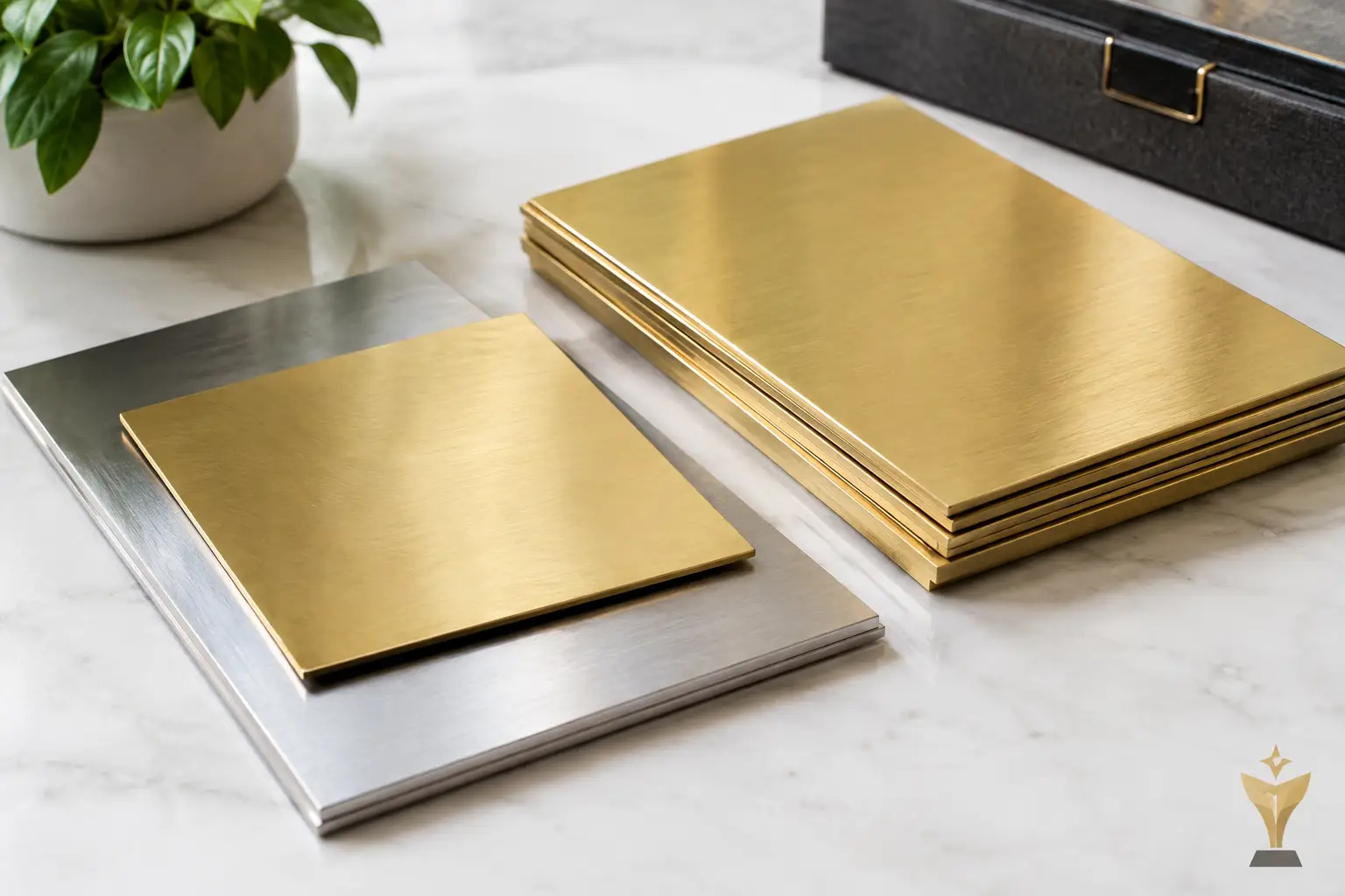
Aluminum and brass plaques for your projects
Custom aluminum and brass plaques: Choose the right metal, engraving, and finish for durable, clear, professional, and reliable signage.