A sign that is poorly worded, placed too high, or already faded fails to do its job — even if it's there. The search "what information safety sign" often comes up when setting up a workshop, school, construction site, municipal building, or staff-only area. The right answer depends on the risk, the location, and the people moving through the space, but one principle holds constant: the message must be understood immediately.
For businesses, organizations, and institutions, safety signage is part of everyday operations. It reduces ambiguity, supports internal guidelines, and helps visitors, employees, and suppliers behave appropriately without having to ask for an explanation at every door.
What information should a safety sign include?
An effective sign pairs a clear instruction with a recognizable visual cue. It doesn't try to explain everything — it indicates the expected action, the hazard to avoid, or the equipment to use. In a noisy, busy, or unfamiliar environment, that conciseness is essential.
The main message may convey a requirement, a prohibition, a warning, an exit, emergency equipment, or an access rule. For example: "Hard hats required," "No smoking," "Caution: slippery surface," or "Emergency exit." The wording must spell out the instruction clearly, without vague phrases like "Be careful" or "Sensitive area."
When a standardized pictogram exists, it should accompany or replace text depending on the context. Pictograms support quick comprehension and are especially useful in locations that welcome a diverse public. That said, they don't always eliminate the need for additional detail. An eye protection symbol may be clear enough in a laboratory, but a shared workshop might still need the note "Safety glasses required in this area."
Supplementary information should only appear if it helps people take action. An emergency extension number, a supervisor's name, a brief procedure, or a directional arrow can all be useful. On the other hand, a dense block of text will rarely be read at the moment someone needs to react.
Colour and shape deliver the first message
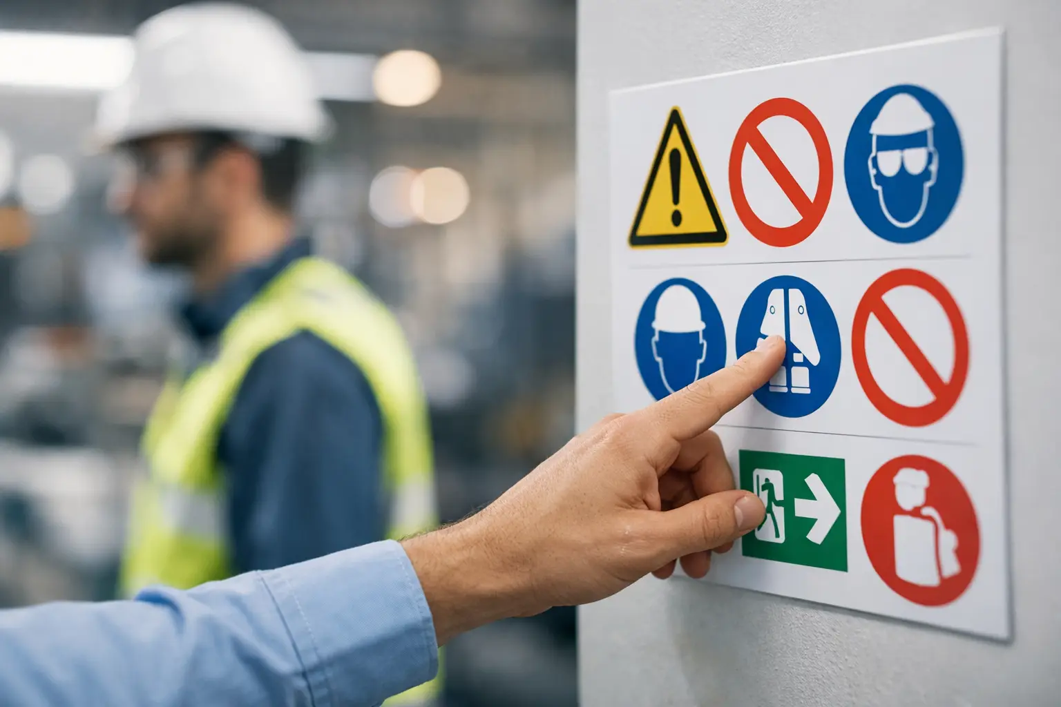
Colour is not decorative. It helps identify the nature of an instruction before the text is even read. In standard signage, red is used for prohibitions and fire-fighting equipment. Yellow or amber draws attention to a hazard or a situation requiring caution. Blue is generally associated with a requirement — such as wearing personal protective equipment. Green indicates a safe condition, an exit, an evacuation route, or a first aid station.
Shape completes this code. A circle with a slash signals a prohibited action, a blue circle signals a requirement, a triangle signals a warning, and a rectangle or square signals safety or emergency information. For a site using multiple signs, maintaining these visual cues from one area to the next makes the overall signage much more intuitive.
Contrast matters just as much. White letters on a light background, an oversized pictogram, or a glossy finish under direct lighting can all make a sign impossible to read. Before production, reading distance, installation height, lighting conditions, and how quickly people move past the sign must all be taken into account.
Matching the message to the risk level and location
Not all safety signs serve the same purpose. A reminder near a mechanical room door is not handled the same way as an emergency exit marker in an arena or a hazardous product warning in a maintenance room. The right sign is one that responds to a specific, real situation.
In a manufacturing facility, signs may address personal protective equipment, traffic zones, operating machinery, chemical products, or lockout procedures. In a school, community centre, or sports complex, priorities often include exits, first aid, reserved spaces, pool rules, technical doors, and slip hazards.
Offices and mixed-use buildings also need consistent signage: restricted access, electrical rooms, telecommunications rooms, fire extinguishers, stairwells, assembly points, and instructions for visitors. A municipality or organization may also benefit from incorporating its visual identity into certain informational signs, as long as this does not interfere with safety colours, pictograms, and messages.
Applicable requirements may vary by province, industry, building type, and organizational rules. Recognized standards and the guidelines of the relevant authority must guide regulatory signage. A signage supplier can produce an accurate and durable piece, but the site manager must validate the content required for their specific environment.
Short, readable, and accessible wording
The language used must suit the people present on site. In Quebec, French-language signage is often required, and depending on the clientele or workforce, a bilingual version can aid comprehension. The goal is not to automatically double every line: a clear visual hierarchy must be maintained, and text should never be reduced to the point of becoming unreadable.
Favour action verbs and familiar words. "Keep door closed," "Wear a face shield," "Do not store materials here," and "Use this exit in case of emergency" are direct and clear. If an instruction involves several steps, the sign should refer to a procedure posted nearby rather than trying to become a wall-mounted manual.
Text size should reflect reading distance. A small pictogram on a piece of machinery may work at close range, while an evacuation sign in a corridor must remain identifiable from a distance. Think also about visitors, new employees, and people arriving at the location for the first time: they are often the best at revealing ambiguous or unclear areas.
Choosing a material suited to the installation
The manufacturing process determines how long a message will last. A sticker may be suitable for a temporary interior surface or for identifying equipment. For a door, corridor, utility room, or area subject to frequent cleaning, a rigid sign generally offers better durability and a more professional appearance.
Engraved Lamicoid is a popular solution for identification plates, permanent instructions, and environments where legibility must stand the test of time. Engraving creates a stable contrast and is particularly well suited to doors, electrical panels, equipment, and restricted areas. Aluminum, acrylic, PVC, and other materials can be selected based on exposure to impacts, moisture, UV rays, or cleaning products.
Screen printing, printing, and laser engraving each produce different results. For large volumes with defined colours, a printing technique may be appropriate. For custom plates, room numbers, variable instructions, or precise markings, laser or CNC engraving delivers excellent accuracy. The choice should take into account quantity, budget, turnaround time, and the expected lifespan of the sign.
Installing Signs in the Right Place and Keeping Them Up to Date
Even a perfectly manufactured sign loses its value if it is hidden by an open door, a stack of boxes, or a display stand. Place it at the point where the decision needs to be made: before entering an area, near the relevant equipment, at a route junction, or directly on the access door.
Periodic checks are necessary. Changes to layout, equipment, procedures, or personnel can make information outdated. Replace signs that are cracked, faded, soiled, or obstructed, and make sure arrows still correspond to the actual path. This attention to detail is especially useful before a sports season, the start of a school year, a public event, or the opening of a new facility.
To order consistent signage, prepare a list of locations, desired dimensions, text, pictograms, required languages, and a photo of the site where possible. A specialist like Mr. Trophy can then guide the choice of material, engraving, printing, and mounting method to ensure that every sign remains clear long after installation.
A good safety sign does not aim to impress — it allows the right person to take the right action at the right moment. It is this clarity, combined with manufacturing suited to the environment, that truly protects your spaces.
You may also like

Order a custom door sign
Ordering a custom door sign: materials, sizes, engraving, and details to consider for clear, durable, and professional signage.
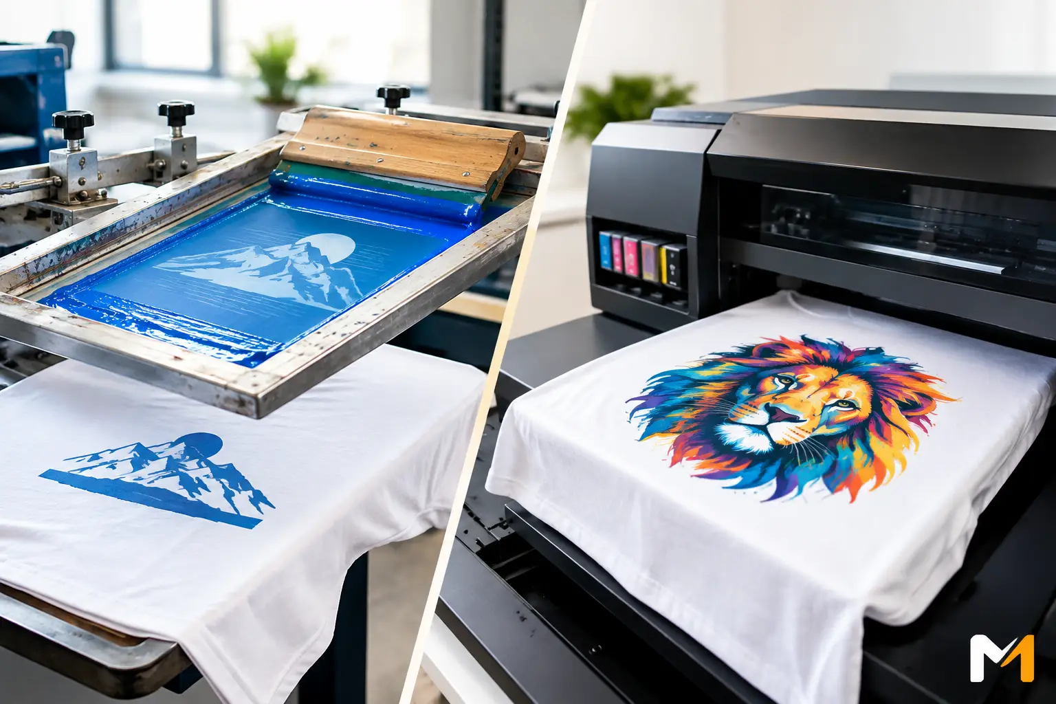
Screen Printing vs. Digital Printing: Which One Should You Choose?
Screen printing vs. digital printing: choose the right technique for your apparel, signs and promotional items for a durable, precise result.

UV vs. Screen Printing: Which Marking Method Should You Choose?
UV vs. screen printing: compare precision, colours, durability and costs to choose the right marking method for your trophies, items and professional signage.