A person looking for reception, a meeting room, or washrooms should not have to ask for directions. Installing interior directional signage is first about making movement obvious, then about producing and installing markers that remain legible despite traffic, cleaning, and changes in how the space is used.
In a school, sports centre, clinic, office building, or city hall, good wayfinding signage reduces interruptions at reception and creates an impression of organization from the moment visitors walk in. It must, however, be designed as a complete journey, not simply as a series of arrows mounted on a wall.
Start by observing how people actually move through the space
Before choosing a material or producing a pictogram, you need to walk through the building as a visitor would. The main entrance, parking area, elevator, stairways, hallways, and intersections are the points where orientation matters most. They are also where requests for directions come up most frequently.
Identify the priority destinations: reception, administration, classrooms, change rooms, washrooms, exits, elevators, delivery areas, and specific offices. An important destination should be indicated before the last junction. An arrow placed directly in front of a door does little for someone who has already passed the corridor they needed to take.
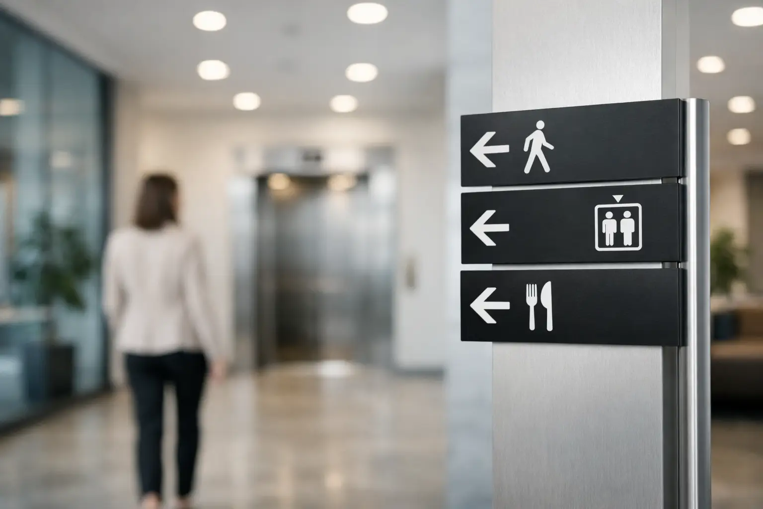
The plan should distinguish between two types of messages. Directional signs indicate where to go, for example "Reception to the right" or "Gymnasium – Level 2." Identification signs confirm arrival, such as a door plate reading "Room 204" or "Human Resources." The two work together: the first guides, the second reassures.
In buildings frequented by the public, also plan for less obvious routes: universal access, secondary entrances, accessible washrooms, emergency exits, and temporary spaces. If an area is restricted to certain individuals, clear identification prevents unnecessary back-and-forth without making the message feel unwelcoming.
Designing signage that is readable within seconds
Interior signage is consulted on the move. A visitor does not read a sign the way they would read a poster. They need to spot a colour, understand an arrow, and recognize a word from several metres away — sometimes while managing children, bags, a wheelchair, or a group.
Keep wording short. "General Management" is less useful than "Administration," and "Sanitary Facilities" can often simply become "Washrooms" when the context allows for it. The vocabulary should match the words used on-site. If staff refer to "Pavilion B," use that designation consistently everywhere, from the directory to the door plate.
Contrast matters more than a graphic effect. Light text on a light background or a decorative font may look elegant on screen but becomes difficult to read in a bright hallway. A simple typeface, sufficiently large characters, and generous spacing around the information yield better results. Standardized pictograms are particularly useful for washrooms, elevators, stairways, and accessibility.
In Quebec, bilingual signage may be relevant depending on the organization, its clientele, and its environment. In that case, both languages must be integrated from the design stage. Adding a smaller translation at the last minute often results in a cluttered sign. It may be preferable to consolidate certain information on a directory or to make greater use of pictograms, without sacrificing the clarity of the French text.
Creating a consistent visual hierarchy
Visitors quickly understand a system when it repeats itself. One colour can identify floors, another public services, while door plates follow a uniform layout. Arrows should maintain the same shape and the same positioning rules from one sign to the next.
This consistency is also useful for internal teams. When a room changes function, they know which sign format to order and what information to provide. For organizations managing multiple buildings, a shared graphic template simplifies future additions and protects visual identity.
Choosing the material based on location and use
The right material depends as much on maintenance as on appearance. A sign installed in a quiet administrative corridor does not have the same requirements as one near a changing room, a pool, or a heavily used door.
Lamicoid remains a practical choice for many directional and identification signs. This engraved material offers clean text, good stability, and a variety of colour combinations. It works well for room numbers, door plates, permanent indicators, and service signs. CNC mechanical engraving in particular allows for precise and durable marking.
Acrylic brings a more contemporary look, especially for reception areas, directories, and corporate spaces. It can be mounted with standoffs to create depth or combined with a printed background. Aluminum is an interesting option in more demanding areas or for an institutional finish. For temporary needs, such as a conference, an open house, or an office reorganization, an adhesive solution or an easily replaceable sign may be more practical than a permanent installation.
The choice of mounting method should be decided at the same time as the sign itself. A quality adhesive may work on a smooth, clean, and stable surface, but it is not ideal on certain textured walls, damp surfaces, or delicate painted finishes. Screws, standoffs, or wall-mounted brackets generally provide better hold for heavier or frequently consulted signs. In all cases, verify what is behind the wall before drilling.
Installing interior directional signage in the right location
Even the best design loses its value if a sign is hidden by an open door, a display rack, or a plant. Installation should be planned using a layout diagram indicating each location, its text, its orientation, and its mounting method. Numbering the signs makes production, delivery, and on-site installation easier.
Install directional signs before intersections, at a consistent and visible height. They should be seen on approach, not only once someone has already reached the junction. In a long corridor, an intermediate confirmation may be needed, particularly if the destination is far away or if several doors look alike.
For door signs, choose a position that is repeated consistently throughout the building: on the door itself, on the handle side, or on the adjacent wall. There is no single right answer. A fire door, a glass surface, or a door that is frequently left open may require wall-mounted installation. The key is to avoid varying placement without reason.
Before removing protective films or finalizing fasteners, hold the sign up to its intended location and take a few steps back. Check the reading angle from both directions of travel. Also assess the lighting: a highly glossy sign can produce glare under certain light fixtures. This simple check prevents costly do-overs.
Planning for changes without starting your entire signage program over
Rooms get renamed, teams relocate, and departments reorganize. Fully permanent signage can become costly to update. For areas likely to evolve, plan for interchangeable plates, inserts, or frames that allow only the variable portion to be replaced.
Keep your graphic files, colour references, dimensions, and location lists on hand. These documents speed up replacement orders and ensure continuity when a building manager changes. They are particularly useful for schools, municipalities, associations, and businesses that order in phases.
An annual inspection is often enough to identify signs that are scratched, peeling, outdated, or simply no longer visible because the layout has changed. Safety signs and accessibility-related indicators deserve more frequent attention, as their role goes beyond everyday wayfinding.
At Mr Trophée, the production of engraved plates, custom signage, and graphic mockups makes it possible to coordinate materials, logos, and information across a single project. The end goal is straightforward: every visitor should know where to go without hesitating, and every facilities manager should be able to update their signage without starting from scratch.
A successful project therefore begins with a walk through the space, seen through the eyes of someone who has never been there before. If the path feels obvious before they even ask a question, the signage is doing exactly what it should.
You may also like

Trophies and Medals for a Basketball or Volleyball Tournament: A Guide for Organizers
Organizing a basketball or volleyball tournament? Here is how to choose trophies, medals and individual awards without going over budget.

Award Ideas for Volunteers, Board Members and Contractors
How to recognize board members, volunteers and long-term contractors: award formats, separate budget lines and calendar dates that fit non-employees.

Aluminum and brass plaques for your projects
Custom aluminum and brass plaques: Choose the right metal, engraving, and finish for durable, clear, professional, and reliable signage.