A visitor looking for the washrooms, an exit, or the reception desk shouldn't have to ask for directions. An accessible wayfinding guide for buildings is designed precisely to turn navigation into a simple, readable, and safe experience. For a school, a municipality, a sports centre, a clinic, or a business, it's not just about adding signs — it's about organizing information that works for people with different visual, auditory, cognitive, or mobility needs.
Well-designed signage reduces hesitation, limits circulation errors, and improves the visitor experience. It also needs to hold up to the real pace of a building: frequent cleaning, heavy foot traffic, renovations, office changes, and service updates.
Start with the routes, not the signs
A good project starts on the ground. Before choosing a door plate, a pictogram, or a material, identify the routes people need to follow. Someone entering for the first time doesn't have the same reference points as an employee, a student, or a regular supplier.
Observe the approach from the parking lot or public transit, the main entrance, reception, elevators, stairways, washrooms, exits, and service areas. Take note of the spots where a decision is required: at a hallway intersection, in front of two similar doors, at a floor change, or approaching a counter.
This analysis helps distinguish three functions. Directional signage indicates a direction, such as "Reception" or "Room 204." Identification signage names a specific space, such as a meeting room or an office. Regulatory or safety signage marks an exit, a posted instruction, or a restricted area. Mixing these functions on a single sign overloads the reader and creates confusion.
Think about real-world use
A wall-mounted map can be useful in a large building, but it doesn't replace wayfinding cues installed at the moment a person needs to turn. Conversely, putting arrows on every wall creates visual fatigue. The right level of information depends on the size of the space, the number of visitors, and the complexity of the layout.
In a school, rooms may change purpose from one year to the next. Interchangeable plates or systems with removable inserts can then avoid the need to redo all the signage. In a clinic or a municipal building, visitor privacy and stress often call for particularly direct and consistent guidance.
The principles of accessible building signage
Accessibility begins with consistency. If washrooms are identified by a pictogram on one floor and then only by text on another, visitors have to relearn the system. Choose stable terminology, recognized pictograms, and a visual hierarchy that repeats from one area to the next.
Contrast is one of the most concrete criteria. Black text on a light background, or white text on a dark background, is generally easier to read than a decorative tone-on-tone approach. Finish also matters: a highly glossy sign can reflect lighting and make text difficult to perceive. A matte or satin surface is often preferable in bright corridors.
Character size should be chosen based on reading distance. A plaque next to a door does not need the same lettering as a sign at the end of a hallway. Avoid decorative fonts, tightly spaced letters, and long lines in all capitals. Simple characters, with adequate spacing and consistent alignment, make for quick and easy reading.
Pictograms complement text but should not become ambiguous. An arrow must clearly indicate direction. A symbol must be familiar to the intended audience. In a bilingual environment, a thoughtful combination of pictograms and French-English labels can reduce clutter while helping more visitors. That said, the necessary space should be planned from the mockup stage, rather than reducing character size at the last minute.
Relief, Braille and Placement
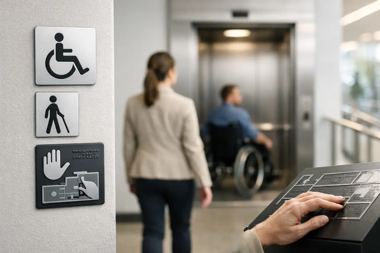
For certain permanent markers — particularly room numbers, washrooms, stairways, or elevators — raised text and braille provide essential information. Their effectiveness depends as much on their placement as on their fabrication. A plaque mounted on an open door can be difficult to locate; installing it on the adjacent wall is often more reliable.
Installation height, clearance around the plaque, and the absence of obstructions must be verified against the requirements applicable to the project. Obligations may vary depending on the building type, the work carried out, and local regulations. For a public, school, or municipal building, it is advisable to have the plan validated by the professionals responsible for the project before production begins.
Braille does not replace clear visual information, just as large print does not replace tactile markers. The goal is to offer multiple ways of accessing the same information, without complicating the route.
Choosing Materials Suited to Each Area
The material must match the intended use, the environment, and how frequently updates are required. An interior plaque for an office door is not subject to the same constraints as an exterior sign exposed to freezing temperatures, sunlight, and de-icing products.
Lamicoid is a common solution for engraved plaques, door identification, technical panels, and directional markers. CNC or laser engraving removes the surface layer to reveal a contrasting colour, producing a sharp and durable inscription. This type of material is well suited to standardized plaque series, room numbers, and applications where consistent legibility is essential.
Acrylic can offer a more contemporary look for a reception area, conference room, or institutional signage. Metal is appropriate for areas requiring high durability or a more formal finish. For exterior use, the choice must account for fasteners, thermal expansion, UV exposure, and seasonal visibility.
Durability does not always mean choosing the thickest or most expensive material. In a community centre where programs change every month, modular plaques may be more cost-effective. In an administrative building with stable occupancy, permanent engraved signage often represents a better long-term investment.
Preparing a Clear and Consistent Order
Efficient production depends on accurate information from the start. Gather final wording, room numbers, floor designations, required arrows, and language versions. A simple numbering error or incorrect orientation can delay installation and require signs to be redone.
It helps to prepare a spreadsheet listing the location, text, desired dimensions, quantity, material, and mounting method for each element. Add photos of the walls or a floor plan when placement is complex. These details allow the manufacturer to spot inconsistencies, suggest compatible formats, and produce a uniform series.
For organizations with multiple sites, create a simple style guide covering colours, typeface, numbering format, pictograms, preferred terminology, and bilingualism rules. It streamlines future orders and prevents each new sign from being designed as a one-off.
Don't Overlook Installation and Maintenance
Even a perfectly engraved sign loses its purpose if it is hidden by a door, mounted too high, or fastened to an unstable surface. Determine in advance whether signs will be screwed, adhered, suspended, or standoff-mounted. Adhesives may work on certain smooth surfaces, but textured, damp, or frequently cleaned walls sometimes require mechanical fastening.
Plan for periodic inspections as well. Replace damaged signs, correct any information that has become outdated, and ensure that temporary furniture, display stands, or decorations are not obscuring wayfinding elements. Accessibility is an outcome that requires ongoing attention, particularly in active buildings where services change over time.
Making Signage a Welcoming Tool
Accessible signage does not have to feel clinical or generic. It can reflect an organization's visual identity, incorporate a logo tastefully, and maintain a professional finish. The priority remains function, however: branding should never reduce contrast, shrink text, or obscure pictograms.
At Mr Trophée, laser engraving, CNC engraving, graphic design, and custom sign fabrication make it possible to adapt formats, materials, and identification series to the specific needs of each building. A well-documented project helps produce consistent signage, from individual rooms to shared common areas.
Before production begins, have someone unfamiliar with the building walk through it using your plan. If they can naturally find the reception desk, washrooms, elevator, and their destination, your signage is already fulfilling its essential purpose: making the building easier to navigate for everyone.
You may also like

Finisher Medals for Running Races and Marathons: A Guide for Race Organizers
5K, 10K, half marathon or family fun run: here is how to choose finisher medals and podium awards your runners will remember. Practical tips from the Mr Trophée workshop in Léry.

Trophies and Medals for a Basketball or Volleyball Tournament: A Guide for Organizers
Organizing a basketball or volleyball tournament? Here is how to choose trophies, medals and individual awards without going over budget.

Guide: How to Plan a Memorable Awards Ceremony
Timeline, length, budget, trophy sizes and run of show: every step to pull off a great awards ceremony, with benchmark figures in CAD.