A poster printed and hastily taped up near a sink often ends up warped, dirty or overlooked. In a busy facility, restroom and hygiene signs should instead deliver a clear instruction in the right place, stand up to heavy use and blend into their surroundings. They contribute to the cleanliness of the premises, but also to the experience of visitors, employees, students, patients and customers.
For a school, an office, a sports facility, a store or a municipal building, well-designed sanitary signage reduces hesitation. It helps everyone find the washrooms, handwashing stations, sanitizer dispensers or areas where a specific instruction applies. The result is not only more orderly: it is easier to maintain and more welcoming.
What Are Restroom and Hygiene Signs Used For?
The term covers more than signs indicating washrooms. It refers to all the posters, plaques and pictograms that guide users and communicate the rules related to hygiene, access or use of a sanitary space. Within a single building, these needs can be very different.
A door plaque identifies a washroom reserved for staff or accessible to people with reduced mobility. A pictogram near a sink reminds users of the handwashing sequence. A wall sign directs visitors to washrooms located at the other end of a hallway. In a communal kitchen, a poster can remind users of the handwashing requirements before handling food. Each element has a specific function: to identify, to direct or to remind people of an action.
The right sign therefore depends on the reading distance and the message. An indication seen from afar must be simple, with a recognizable symbol and strong contrast. An instruction to be read in front of a handwashing station can include a few more steps. Confusing these two uses results in signage that is too cluttered from a distance or too vague up close.
Restroom and Hygiene Signs to Plan for in Your Spaces
Before choosing materials and graphics, it helps to do a short walkthrough of the premises. Follow the path of someone who doesn’t know the building: entrance, reception, hallways, washrooms, locker rooms, cafeteria, treatment rooms or restricted areas. The points where they have to look around, ask for help or turn back reveal your signage needs.
Identifying Washrooms and Restricted Areas
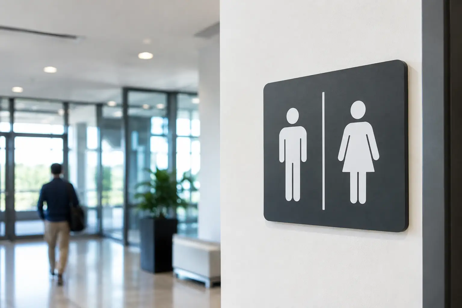
Washroom door plaques are the best known. They can indicate a single-occupancy washroom, a family room, a locker room, a shower, a staff-only space or an accessible facility. A pictogram alone may be enough when the context is obvious; bilingual text is often preferable in places that welcome a diverse public in Quebec and elsewhere in Canada.
Consistency is essential. The same pictograms, colours, dimensions and placements should be used throughout the building. Uniform signage lets visitors quickly recognize the system, even when they change floors or sections.
Hand Hygiene and Use of Equipment
Reminders about handwashing, hand sanitizer use and surface cleanliness need to be placed where the action takes place. Near a sink, a concise sign is more effective than a notice posted at the exit. In environments where employees handle food, products or shared equipment, the instructions must remain legible despite splashes, frequent cleaning and repeated contact.
Tone matters as well. Direct, positive and specific wording generally gets better results than a stern or vague message. "Wash your hands before returning to work" states an action and a moment. "Be clean" leaves too much room for interpretation.
Wayfinding and traffic flow
A restroom can be perfectly identified and still be hard to find. Directional signs in hallways, near elevators or at intersections guide visitors without tying up reception staff. Arrows must match the actual route and be checked after any renovation or reorganization of the space.
In large sports complexes, schools and community centres, it often makes sense to coordinate restroom signs with the general signage. Typography, institutional colours and pictograms can form a cohesive set with room plaques, locker room signs and exit indicators.
Choosing a material suited to the environment
In restroom areas, the choice of material is not just a matter of looks. Humidity, cleaning products, impacts and the frequency of cleaning all affect how long a sign will last. An inexpensive solution that peels off quickly leads to replacements and gives an impression of neglect.
Lamicoid is commonly chosen for door plaques, labels and small identification signs. Durable and available in many colour combinations, it allows for crisp engraving that stays legible for a long time. CNC engraving is particularly well suited to structured plaques, room numbers and permanent messages.
Acrylic offers a clean, contemporary look for offices, clinics, hotels or renovated facilities. It can be printed, engraved or mounted with standoffs depending on the desired effect. For a sign that is heavily exposed to water or installed in a demanding area, the choice of substrate, adhesive and mounting method must be based on actual conditions.
Printed stickers and vinyl remain useful for temporary instructions, seasonal campaigns or quick additions. They are less appropriate for permanent identification on a surface subjected to intensive washing. There is no single ideal material for every project: a small door pictogram and a directional wall sign do not serve the same function or face the same constraints.
Designing clear and accessible signage
An effective sanitary sign doesn't try to say everything. It prioritizes the information that users need to understand within a few seconds. The contrast between the background and the text, the size of the characters, the mounting height and the quality of the pictograms all have a direct impact on legibility.
Avoid crowded text, decorative fonts and color combinations that are hard to tell apart. If your facility serves children, seniors, international visitors or people with visual impairments, simple symbols and an airy layout become even more important. French-English bilingual text can also be included without overloading the sign when the message is short and well organized.
Accessibility deserves careful thought from the design stage. Some installations must meet specific requirements depending on their sector, their use and their jurisdiction. Dimensions, pictograms, placement and, in some cases, raised lettering or braille can be decisive. A sign manufacturer can produce the requested elements, but the building manager must confirm the standards that apply to their project.
Customizing without complicating the message
Sanitary signage can feature an organization's logo, repeat its colors or blend in with its interior design. This customization is especially popular in schools, sports centres, businesses and public-facing facilities. However, it should support readability rather than compete with it.
The best approach is often to reserve the visual identity for a band, a header or an accent color, and let the pictogram and the message dominate. An oversized logo can undermine a sign's primary function: helping people quickly understand where to go or what to do.
At Mr Trophée, the combination of graphic design, printing, laser engraving and CNC engraving lets us adapt plaques, pictograms and signs to the needs of the space. For a larger project, grouping door plaques, directional signage and hygiene reminders together creates a uniform look while simplifying order coordination.
Preparing your order properly
A signage project moves faster when the essential information is gathered from the start. Plan for the number of signs, the exact text in each language, the desired pictograms, the approximate dimensions, your organization's colors and photos of the mounting surfaces if they are unusual. Also specify whether the signs will be attached with adhesive, screws or standoffs.
For institutional orders, a location schedule is useful. It matches each sign to a room number or a specific location, which reduces errors during production and installation. Also keep an approved final version of room names, arrows and messages. A single late change can delay an entire series of plaques.
It's wise to order a few extra units for areas that are likely to change, such as staff offices, multipurpose rooms or temporary zones. For permanent fixtures, on the other hand, it's best to confirm the final layout before production begins.
A successful washroom sign rarely draws attention to itself: it simply helps everyone find their destination, understand the instruction and use the space with confidence. That simplicity, backed by appropriate materials and careful production, is what gives value to every plaque installed.
You may also like

Trophies and Medals for Pickleball Tournaments in Quebec: A Guide for Organizers
Pickleball keeps growing across Quebec, and so do tournaments. Here is how to plan trophies and medals without miscounts or last-minute stress.

Five Mistakes That Turn a Gift into a Forgotten Expense
Understated logo, useless item, anonymous presentation: five mistakes that make a corporate gift forgettable, and how to fix them at no cost.

Participation Medals for Youth Sports: Recognizing Every Child the Right Way
Medal, small trophy or plaque: how to recognize every young athlete's season while respecting your association's budget. Practical workshop tips for ordering well.