
A visitor who has to search for the reception desk, the washrooms or the meeting room starts their experience with avoidable friction. Directional signs serve a very concrete purpose: they help people move through a space, find a service and respect designated access points without having to ask for directions at every turn. In a school, a sports complex, a municipal building or a company's offices, they contribute directly to the efficiency of the welcome experience.
Good signage goes beyond putting arrows on walls. It must reflect actual traffic patterns, remain readable at a glance and hold up under the conditions of its environment. The choice of material, engraving, printing and mounting matters just as much as the text being displayed.
Start with the pathways, not the signs
Before choosing a colour or a format, you need to observe the people arriving on site. Where do they park? Which entrance do they use? Where do they make their first decision? A sign placed after an intersection solves nothing: the information must appear before the moment the visitor needs to choose a direction.
This kind of thinking is especially useful in spaces that welcome a varied public. A community centre may receive children, parents, suppliers and people with reduced mobility. A clinic may need to direct people to the reception desk, waiting rooms, lab services and exits. In these contexts, the same route is not always obvious to everyone.
It is generally best to organize wayfinding across several levels. At the entrance, a general sign presents the main zones. At intersections, indicators narrow the choice down to a few destinations. Near the door, a plaque clearly identifies the room or service. This progression prevents overcrowded signs and limits unnecessary repetition.
Directional signs readable within seconds
The goal is not to have someone read a paragraph. A person on the move must understand the message quickly, sometimes from several metres away. Words should therefore be short, consistent from one sign to the next and suited to the vocabulary of the people using the space.
For example, if the site uses the term "Reception," it is better to avoid using "Welcome Desk" or "Information" to refer to the same place elsewhere. Consistency reduces hesitation. The same applies to arrows, pictograms and colours: a convention, once chosen, should remain the same throughout the entire building or site.
Character size depends on reading distance and speed of movement. In a narrow corridor, a wall plaque can be compact. In a gymnasium, an arena, a parking area or an open reception zone, the text must be larger and the contrast more pronounced. A simple typeface with well-spaced letters is often more effective than a decorative style that is difficult to read.
Contrast deserves special attention. Light text on a light background, a very prominent logo, or colours that are too similar can hinder readability, even if the design looks great on screen. The result should be evaluated under real lighting conditions: natural light, evening lighting, glare on a glass door, or dust in an industrial setting.
The Right Amount of Information
A directional sign should indicate a destination and a direction. Adding hours of operation, site rules, a list of partners, and several room numbers on the same sign dilutes the message. This information may be useful, but it often belongs on a separate information panel.
In a large facility, a colour code can complement the text. Blue might identify administration, green the sports facilities, and another colour the training spaces, for example. This approach only works if it is applied consistently and if the text remains readable without relying solely on colour.
Choosing the Right Material for the Location
The material determines the appearance, but also the lifespan and maintenance required. An interior plate near offices does not face the same constraints as a sign installed in a busy corridor or outdoors.
Lamicoid is a practical solution for many directional plates, door plates, and room identifications. Its multi-layer construction allows text and symbols to stand out through engraving, with a clean and durable finish. It is well suited to schools, offices, clinics, workshops, and institutional spaces that require clear and consistent identification.
Acrylic can offer a more contemporary look, particularly at reception areas or in corporate spaces. It can be used on its own or combined with standoffs, a printed background, or other materials. Its appearance should, however, be chosen with glare and text visibility in mind.
For more demanding environments, metals, rigid plastics, and certain outdoor-rated substrates are preferable depending on exposure to sun, moisture, frost, and impact. An outdoor sign must also be designed with its mounting in mind. A well-made panel that is installed in a poorly visible or vulnerable location will not serve its purpose for long.
Engraving, Printing, or Cutting?
The marking method depends on the material, the design, and the intended use. Laser or CNC engraving is particularly well suited to text, numbers, pictograms, and plates that need to withstand frequent handling. It provides precise and permanent marking on a wide range of substrates.
Printing or screen printing is a strong option when a sign includes brand colours, a large visual, detailed graphic elements, or a series of identical panels. Vinyl cutting can also meet certain needs, particularly on glass, a door, or a temporary surface. The best process is not always the most elaborate one: it depends on the desired result, the volume, and the intended lifespan.
Planning for Changes Without Replacing the Entire Signage System
Spaces change occupants, services relocate and schedules evolve. In a school, a room may be reassigned every year. In a business, a team may move to a different floor. Planning for this reality from the start reduces update costs.
Interchangeable plaques, removable inserts or a base structure with replaceable elements can be relevant in evolving spaces. Conversely, permanent engraving is often the best choice for exits, security areas, stable services or building names. It is therefore important to distinguish what is lasting from what is likely to change.
Logical numbering also makes management easier. Visitors find it much simpler to confirm they are in the right area when numbers follow a floor, wing or sector logic. This consistency also helps staff, delivery personnel, emergency responders and new employees.
Aligning Wayfinding with Your Organization's Identity
Effective signage can incorporate a logo, institutional colours or typography, but it should never sacrifice function for style. Highly colourful brands or detailed logos are sometimes better used on welcome panels and main signs than on every directional arrow.
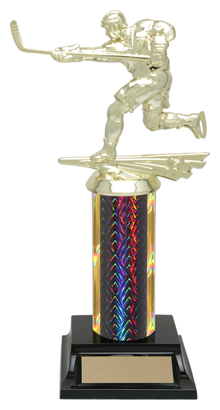
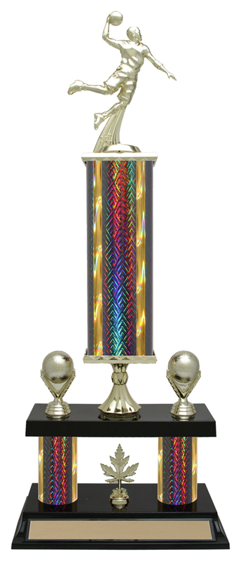
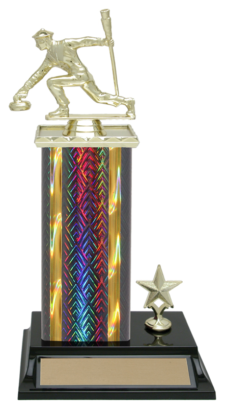
For a sporting event, a league can match its directional signage to the banners, medals and trophies presented throughout the season. For a municipality or a school, uniformity across door plaques, room identifications, directional panels and welcome displays strengthens the overall presentation of the site. The benefit is as much practical as it is visual: people recognize landmarks more quickly when they belong to the same graphic family.
A engraving, printing and signage specialist can help establish this consistency before production begins. At Mr Trophée, projects can bring together engraved plaques, door signs, Lamicoid products and visual elements tailored to the organization's needs, with an approach grounded in material, intended use and the information to be displayed.
Testing the Route Before Final Production
Before ordering a full series, walk the space as someone discovering it for the first time. Enter through the parking area or main entrance. Note the moments where you hesitate, the doors that look alike and the intersections where multiple directions are possible. This walkthrough often reveals needs that the building plan does not show.
It is also important to confirm the spelling of service names, room numbers, logo versions and the required languages. In Quebec, bilingual signage may be relevant depending on the audience being served and the organization's context. When two languages are required, they should be integrated from the design stage to preserve message clarity, rather than being added into a space that is already too crowded.
Successful directional signage is rarely noticed for its own sake. It does something better: it allows every person to reach the right place with confidence, while giving your facility a polished, consistent and welcoming appearance.
You may also like
Guide to Washroom Signs for Businesses
Workplace restroom sign guide: materials, pictograms, accessibility and installation for clear, durable signage in Quebec.

Finisher Medals for Running Races and Marathons: A Guide for Race Organizers
5K, 10K, half marathon or family fun run: here is how to choose finisher medals and podium awards your runners will remember. Practical tips from the Mr Trophée workshop in Léry.

Trophies and Medals for a Basketball or Volleyball Tournament: A Guide for Organizers
Organizing a basketball or volleyball tournament? Here is how to choose trophies, medals and individual awards without going over budget.