
A ruined award plate is not an engraving problem. It is a proofing problem. By the time the cutter touches brass, crystal, or acrylic, every misspelled name, missing accent, and undersized line was already visible in the proof. That is why beginners in trophy engraving must learn to review text, layout, and files before production begins.
This post explains exactly how to catch those expensive errors early. You will learn why engraving mistakes reach the cutting table, then work through six common failures: misspelled and misformatted names, missing accents on bilingual plates, text set too small or too thin for the material, logos sent without vector outlines, spacing and alignment problems that only appear on the finished plate, and brand color or tone mismatches. You will also get a practical pre-production review protocol with seven checks, a quick material-by-material sanity check, answers to frequent questions about engraving proofs, and a simple way to make proof review a habit instead of a rescue.
Read this before you approve your next award plate. A few minutes of careful checking can protect your budget, your credibility, and the ceremony date.
Why Engraving Errors Reach the Cutting Table
Engraving is subtractive. Once the laser or cutter passes, material is gone. There is no undo, no paint-over, no second pass that adds material back.
A plaque is a permanent artifact. Its design and quality reflect the value of the achievement it recognizes, so a visible flaw sits in the room for years, not just on an invoice.
In most cases the engraver cuts exactly what was submitted; the error was missed at the proof stage, not created at the machine. That is why an approved proof is a controlled document, not a courtesy preview (contract proof creation).
Plan ahead for busy periods: a redo must compete for the same queue space as any new order.
The next six sections cover the error categories that survive to production, then a pre-production review protocol you can run in minutes.
Error 1: Misspelled and Misformatted Names
Names are the one element of a plate that must be perfect. Read every name character by character against a source document: a registration list, roster, or HR record. Never proof from memory, and never from last year's plate, which repeats old errors.
Watch the silent killers: hyphenated surnames, apostrophes (O'Brien, D'Angelo), Mc versus Mac, internal capitals (McDonald, DeVries), and accents dropped by whoever typed the list.
Confirm which version is intended, full legal name, preferred name, or nickname, plus any honorific such as Dr., Me., Maître, or Rev. Ask rather than assume; name order and form vary by culture, so clarification may be needed on which name is the family name.
Then check the formatting: single spaces, consistent capitalization, no stray punctuation. One extra space is as visible as a wrong letter. A misspelled name is the error a recipient never forgives, and the cheapest to catch. A careful read before approval prevents it.
Error 2: Missing Accents and Broken Bilingual Plates
Accents break in the file handoff. Characters such as é, è, ê, à, ç, ù, ô and î can appear as a blank box or a bare vowel when a font lacks the glyph or the text encoding is wrong, because equivalent-looking text can be stored as different bytes (Unicode normalization forms).
Ask two questions before anything is scheduled: Is the plate bilingual? If so, which line is French and which is English? A mixed plate needs a proof showing both languages exactly as they will be cut.
Then run the checklist on proper nouns: Université, Cégep, École, Hydro-Québec, and surnames such as Lévesque, Bérubé, Côté and Thériault.
All-caps settings deserve extra care; accent rendering and character spacing can vary by font. Verify that all accented characters appear correctly in both upper and lower case in the proof.
This is Québec's quiet trap. Buyers assume accents carry through automatically, and they usually do, until a font substitution breaks them.
Error 3: Text Set Too Small or Too Thin for the Material
Accents survive the file handoff; type size is the next thing proofing misses, because a screen flatters every typeface.
Text that looks crisp on a monitor can fill in, fade, or chip once it is engraved. Minimum legible size depends on three variables: the substrate, the engraving method, and the weight of the typeface. Hairline serifs, thin script faces, condensed type, and light weights are the risky choices. A font size that reads clearly on screen can disappear once engraved on certain substrates -- ask your engraver to confirm legibility on the chosen material.
Design for the reading distance. A plate viewed from across a room needs larger type than one read hand-held. Ask where the award will be displayed, then size the smallest line for that distance.
Cut words, not type. Too many lines force the type smaller. Fix the copy, not the point size.
Before the job is scheduled, ask your engraver to confirm the smallest text is legible on the chosen substrate.
Error 4: Logos Submitted Without Vector Outlines
Text size is not the only proofing trap. Artwork supplied at the wrong resolution fails just as silently.
Vector files (AI, EPS, SVG) scale without quality loss; pixel-based images such as JPG or PNG can engrave poorly when enlarged. Ask your engraver which formats they accept. A high-resolution PDF with the logo converted to outlines -- meaning the text is no longer editable type -- is also widely accepted. Submissions that almost always fail: a logo pasted into a Word document, a screenshot, an image pulled from a website, or a photo of a sign or business card.
Outlines matter for more than sharpness. Live text in a logo file may not display correctly on a different system; converting text to outlines locks the design. Outlines freeze the logo exactly as drawn.
If only a raster logo exists, ask about a redraw or a simplified single-colour version before assuming the job is impossible. Next: layout errors that only surface at plate scale.
Error 5: Layout, Spacing and Alignment That Only Show on the Plate
Before you approve, check the layout against the plate itself, not the screen.
Measure the usable area. A border, bevel, or frame shrinks the printable zone. Text placed too close to the edge can be clipped during cutting.
Scan for spacing faults. Uneven line spacing and orphaned words, where a single word wraps alone onto its own line, read as carelessness on a plate that will hang on a wall for a decade.
Verify the date. Formats differ: 2026-06-12, June 12 2026, and 12 juin 2026 are three different-looking results. Confirm both order and language on bilingual plates.
Confirm hierarchy. The recipient's name should dominate, the award title should support it, and the organization's name and date should sit last. Set everything at the same size and nothing reads.
Review at true scale. Check the proof at 100 per cent and printed at actual size; flaws invisible when zoomed out jump out at full scale.
One error category remains: brand, colour, and tone.
Error 6: Brand, Color and Tone Mismatches
Not every ruined plate contains a typo. Some are wrong in a way that only registers when the award sits beside your other materials. Use official brand colours, the approved corporate logo version and sanctioned typography; mismatched hues and fonts undermine organizational consistency and make the award look like it came from somewhere else.
Decide formality before design. Match the weight of the treatment to the occasion: a ceremonial award warrants a formal register, while everyday recognition can carry a lighter look.
Check the logo rules first: approved version, clear space, minimum size, and whether a department, sponsor or partner lockup belongs on the plate. Confirm the wording matches your organization's voice and the occasion, and that any sponsor or partner logo is cleared for award use. Let the occasion guide the material choice. All of this is checkable on the proof, before anything is cut.
The Pre-Production Review Protocol: Seven Checks Before the Plate Is Cut
Once brand assets and tone are settled, the remaining risk lives in the small details. Run these seven checks before the job enters the queue.
Request a digital proof. Ask for a PDF showing the exact text, typeface, and layout you will receive. Never approve work from a verbal description.
Read every name aloud. Work character by character against the source list with a second person following along. Two sets of eyes catch what one pair reads past.
Confirm accents and language line by line. Verify French spelling and grammar, not just the diacritics (é, è, ç, ù), and state clearly which line is French and which is English.
Check the smallest text against the material. Ask the engraver to confirm minimum legible size on your chosen substrate before cutting begins.
Require outlined vector logos. Confirm accepted file formats before the job goes into the queue.
Review at 100 percent and true print size. Check edges, margins, centering, and line breaks. Errors that vanish on a zoomed-out screen jump out at actual scale.
Approve in writing and keep your copy. The approved proof becomes the reference point if anything is ever disputed.
Finally, build buffer days into your schedule. During busy periods, a redo must wait for the same queue space as any new order -- build buffer time into your schedule.
A Quick Material-by-Material Sanity Check
With your proof approved and your queue slot booked, one decision still governs everything: the material itself. The following is practitioner guidance, not a sourced standard; confirm specifics with your engraver.
Metal (brass, aluminum, stainless steel): crisp and durable, but very fine strokes may not reproduce cleanly -- confirm stroke width with your engraver.
Acrylic: clean and modern, and colour printing adds vibrant fills, but the surface is sensitive to fine detail -- ask your engraver about minimum stroke width.
Wood: warm and traditional, though wood grain can interfere with very small text -- use heavier, larger type.
Glass and crystal: elegant but low contrast. Etching on clear glass produces low contrast -- confirm visibility at the intended viewing distance, and plan the lighting where the award will sit.
Choose the material for the occasion first, then design type and logo treatment to fit it. Forcing a design onto a substrate that cannot hold it is the error no proof can catch. Browse our engraving services or learn how our Léry workshop operates before you finalize your order.
Frequently Asked Questions About Engraving Proofs
Whatever the material, four questions return before every cut.
How do I check my engraving proof? See the seven-check protocol above.
What file format do you need for a logo? Vector formats (AI, EPS, SVG) or an outlined PDF -- see Error 4 for details.
Can a mistake be fixed after the plate is cut? Engraving is difficult or impossible to reverse; contact your engraver immediately if you spot an error, and ask whether a new plate is required. That is why review happens before cutting.
How far ahead should I order before a ceremony? Build in buffer days beyond the quoted turnaround -- during busy periods such as year-end, a redo must wait for the same queue space as any new order.
Make Proof Review a Habit, Not a Rescue
The pattern behind every ruined plate is the same: the error was in the proof, not in the engraving. That makes proof review the cheapest insurance in your entire order.
The seven checks above -- names character by character, accents, vector logos, minimum text size, layout at true scale, and written approval -- are the habit.
Send your proof for review before production begins. If your ceremony date is close, call early: a redo has to fit inside the same window as the original job.
Proof review is part of the service, alongside laser engraving and colour printing, for trophies, medals, plaques and honorary awards. Mr Trophée offers bilingual service and a best-price guarantee to teams, businesses, municipalities and organizations across Quebec. Call 514-565-6665, or browse our engraving and award services to get started.
Conclusion
Award plates fail on the proof, not at the engraver. The seven checks above are the habit that prevents it.
Before your next ceremony, send the proof early, call 514-565-6665, or browse our engraving and award services. Review the proof today, and let the award speak only of achievement.
You may also like

Trophies 2026 for an Award Ceremony That Matters
Plan your 2026 trophies: materials, engraving, lead times, and personalization ideas to honour every achievement with a lasting, polished finish.
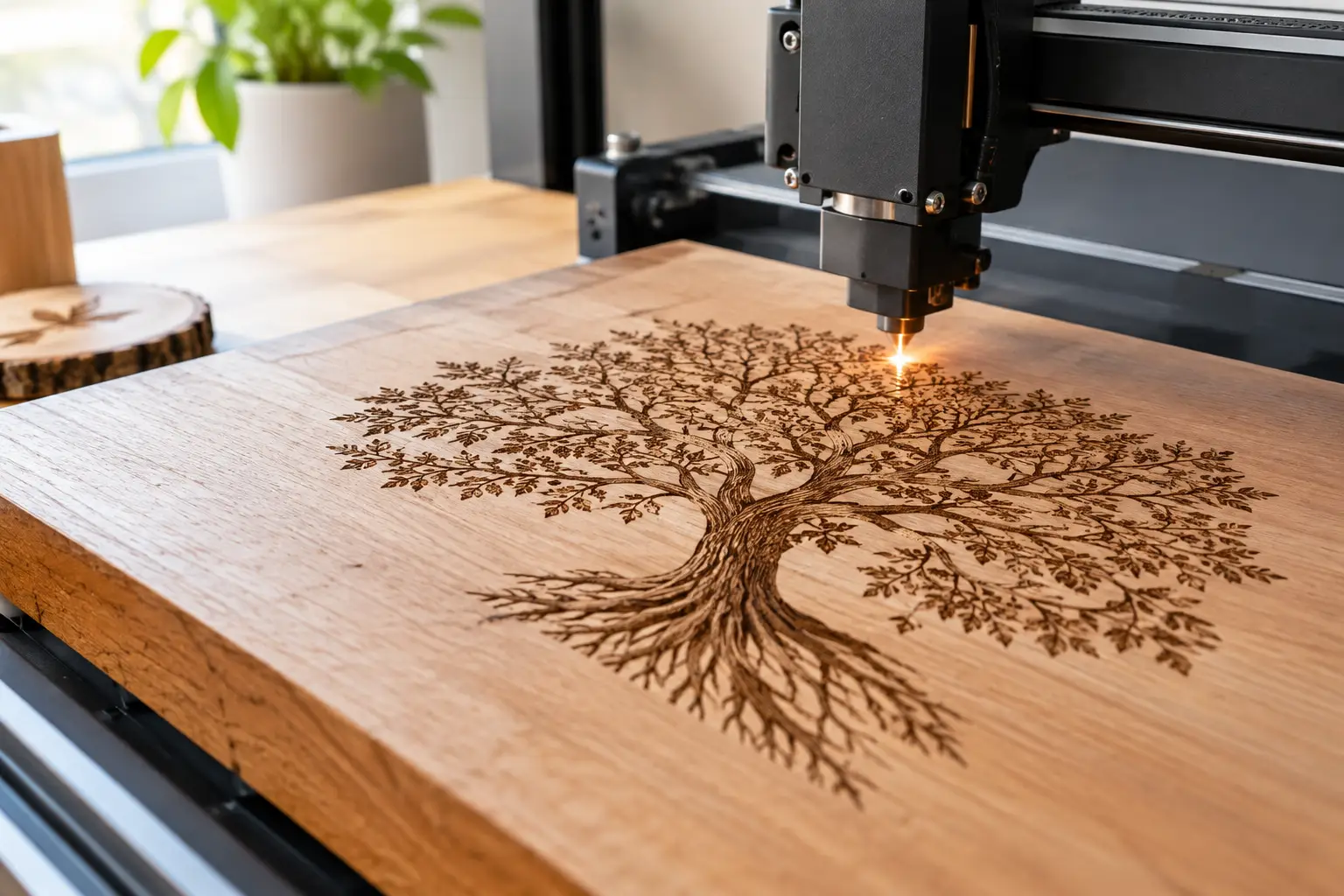
Laser Engraving, an Art That Will Last Forever
For trophies, plaques, gifts and signage, laser engraving, an art that will last forever, inscribes each name with precision, finesse and durability.
Personalized Engraving on Metal, Glass or Acrylic: Which Material Should You Choose for Your Award?
Metal, glass or engraved acrylic: compare durability, prestige and cost to choose the right material for your industry and budget.