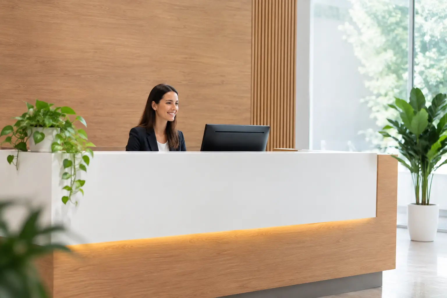
A visitor who hesitates at an entrance, a front desk, or a hallway begins their experience with an unanswered question: where do I go? Creating a professional welcome sign immediately addresses that question while setting the tone for your organization. In a school, an office, a sports centre, a municipal building, or a clinic, this signage must be easy to read, true to your image, and designed for the actual use of the space.
A good sign does more than display a logo. It confirms that the person is in the right place, points toward a reception desk or a service, and can convey useful instructions right from arrival. To achieve this, the choice of content, material, format, and marking method deserves just as much attention as the visual design.
Define the sign's purpose before choosing its format
The word "welcome" covers several needs. An outdoor sign can identify a building's main entrance. An interior plaque can direct visitors toward the reception desk. A counter sign can display hours of operation, safety rules, or a check-in procedure. These products do not share the same constraints, even when they are part of the same visitor journey.
Start by determining what the sign must accomplish within a few seconds. Is it meant to name the organization, indicate a direction, present several departments, or display a temporary message? The clearer the purpose, the more concise the text will be and the more appropriate the choice of medium.
A sign placed at the entrance of a community centre, for example, might include the facility's name, its visual identity, and an arrow pointing toward the welcome desk. Conversely, signage placed directly on the reception door is best kept simple: "Welcome," "Reception," or "Administration," accompanied by service hours when needed.
Think about the journey, not the sign in isolation
Signage is most effective when it forms a logical sequence. Visitors should be able to spot the building, confirm the entrance, find the welcome desk, and then identify the right office or room. An excellent reception sign cannot make up for a poorly identified entrance.
For schools, associations, municipalities, and businesses that occupy multiple areas, establishing a uniform naming system is worthwhile. Consistent typography, colours, pictograms, and levels of information allow landmarks to be recognized quickly. This consistency is especially appreciated in spaces frequented by the general public, new employees, or event participants.
Creating a professional welcome sign with the right content
Readability comes before an abundance of information. The organization's name, a "Welcome" or "Reception" label, and a directional indication are often the priority elements. A logo reinforces identity but should not take up all the space if the sign also needs to guide someone who is unfamiliar with the premises.
Avoid long sentences, repeated contact information, or details that only a small number of visitors will need. A message that is too dense is difficult to read while standing, from a distance, or when there is foot traffic. If you have several pieces of information to communicate, spread them across a main panel and secondary signs near the counter.
Font size should match the reading distance. Text meant to be visible from a parking lot or a corridor requires significantly larger letters than a plaque consulted from a metre away. Strong contrasts — light text on a dark background or dark text on a light background — are generally more effective than similar shades. Decorative effects may look attractive on a screen, but they should never get in the way of quick readability.
In a bilingual environment, plan from the start for the space needed by both French and English. The hierarchy must remain clear in both languages. Depending on your clientele and your obligations, the two versions may carry equal weight, or one may complement the other. The key is not to reduce the text to the point where it becomes difficult to read.
Choosing a Material Suited to the Location
The material determines the sign's appearance, its durability, and the customization options available. It should be chosen based on exposure, installation method, and expected maintenance.
Lamicoid is a practical solution for identification plates, doors, reception areas, and interior panels. Available in several colours, it allows for clean engraving that creates a lasting contrast. It works well for service names, room numbers, instructions, and matching directional signs.
Aluminum offers a clean, durable look for interior or exterior use, depending on the finish and installation. It is a popular choice for institutional buildings, entryways, and permanent plaques. Acrylic can provide a more contemporary appearance, particularly with decorative mounts, colour printing, or wall-mounted installations. It is especially well suited to offices, clinics, showrooms, and reception areas where visual presentation is a priority.
Wood can be a good fit for an outdoor centre, a boutique, a cultural organization, or any space looking for a warmer signature. However, its exposure to humidity, sunlight, and temperature changes must be taken into account. For outdoor use, durability depends as much on the material as on the finish, the hardware, and the chosen location.
Glass delivers a high-end effect for a corporate reception area or a commemorative plaque, but it requires a protected location and careful handling. It is not always the most practical choice in high-traffic areas or sports facilities, where a more durable material may better meet everyday needs.
Engraving, Printing, or Cutting: the Method Matters
Personalization must respect the material and its intended use. Laser engraving produces precise markings on many surfaces and is well suited for text, logos, and fine details. CNC engraving is useful for certain materials and for work requiring a specific depth or format. Screen printing allows you to add colour and reproduce a visual identity across a series of panels or promotional items.
The choice depends on the desired result. An engraved plate provides lasting information, even in settings where it is frequently touched or cleaned. A printed panel may better reproduce complex brand colours or detailed visuals. In some projects, combining techniques yields the best outcome: an engraved base for permanent information, with printed or interchangeable visual elements for variable communications.
Plan for Installation and Maintenance from the Start
A well-made panel can lose its effectiveness if it is poorly placed. Install it within the natural sightline of visitors, without hiding it behind an open door, a plant, a display rack, or a queue. Outdoors, also check visibility during the day, in the evening, and in winter, when snow or lighting conditions alter familiar landmarks.
The mounting system is part of the project. Screws, standoffs, industrial adhesive tape, posts, frames, and counter displays do not serve the same needs. A door plate can be mounted discreetly, while an outdoor panel must withstand the elements and sometimes vandalism. Irregular, glazed, or high-traffic surfaces require a tailored solution.
Consider future changes as well. Employee names, offices, hours, and services evolve over time. A system made up of replaceable inserts or individual plates can reduce update costs. Conversely, a building name or primary identification often warrants a higher-quality permanent installation.
Gather All Elements Before Production
Thorough preparation speeds up visual approval and limits revisions. Before requesting a quote, gather the final text, your logo in a high-quality file, your organization's colours, the desired dimensions, and a photo of the intended location if possible. Also indicate whether the panel will be installed indoors or outdoors, the type of surface, and the date by which it must be ready.
For a project that includes several products — an entrance panel, door plates, office nameplates, directional signage, and promotional apparel for the welcome team — consolidating your needs helps maintain a consistent identity. At Mr. Trophy, graphic design, laser engraving, CNC engraving, screen printing, and identification product manufacturing services make it possible to tailor the marking to the chosen medium.
A professional welcome panel succeeds when it feels self-evident to the person reading it: it confirms the location, indicates the next step, and carries your image with precision. By taking the time to choose a clear message and a finish suited to your space, you turn a simple sign into a reliable landmark for every visitor.
You may also like

Hall of Fame: How to Create a Wall of Honour for Your Club or Business
A well-designed wall of honour keeps your organization's history alive and inspires the next generation. Here is how to choose the format, materials and engraving so it lasts for years.
Professional Locker Room Plaque Guide
Locker Room Plaque Guide: Materials, engraving, and formats to identify lockers, areas, and users with precision and everyday durability.
Order a custom door sign
Ordering a custom door sign: materials, sizes, engraving, and details to consider for clear, durable, and professional signage.