Visitors only give you a few seconds before moving along the aisle. Your trade show banners must therefore answer three questions immediately: who you are, what you offer, and why they should stop at your booth. A well-crafted banner doesn't replace a welcoming team, but it makes your presence noticeable before the first conversation even begins.
For a school, municipality, association, sports team, or business, a trade show is often a major investment concentrated over just one or two days. Signage must be clear, easy to transport, and durable enough to be reused for recruiting, an open house, a tournament, or a recognition event. Making the right choice is less about trendy formats and more about your space, viewing distance, and intended use after the event.
Why Trade Show Banners Matter
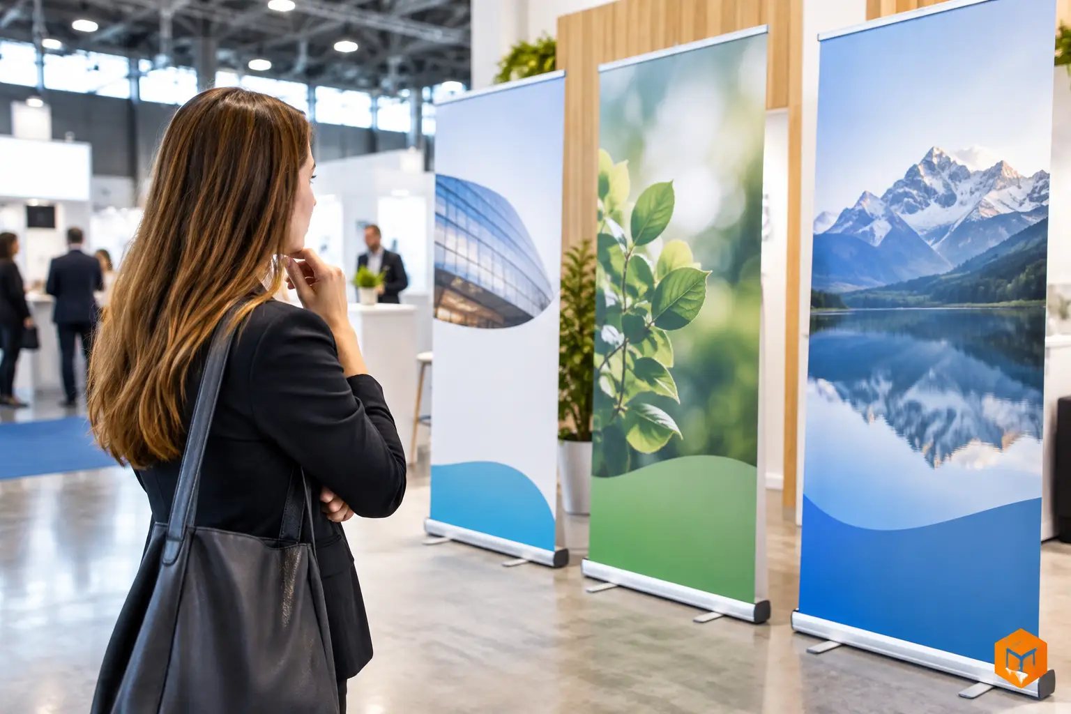
In a room packed with booths, a table with a few brochures quickly gets lost. A vertical banner puts your name, logo, and message at eye level. It also defines your space without cluttering it, which is especially useful for 10-by-10-foot booths or hallway setups.
Its role isn't to present your entire organization. Instead, it should serve as an entry point. An effective banner can highlight a service, a recruitment campaign, an upcoming event, or a manufacturing specialty. The details—pricing, specs, forms, and catalogues—stay on the table or are presented by your team.
This distinction helps avoid a common mistake: trying to cram an entire brochure onto a large display. Even a large-format banner will be read quickly and often from a distance. Too much text, too many partner logos, or competing visuals will dilute its impact.
Choosing the Right Format for Your Booth
The retractable roll-up banner works well for most trade shows. It sets up quickly, packs into a carrying case, and is easily moved from one event to the next. It's a practical choice for coordinators setting up their own booth, recruitment teams, and organizations that need to store their gear in limited space.
A banner with a fixed frame may be preferable when the display is meant to stay in place for a long time, such as in an entrance lobby, arena, community centre, or association office. It provides a more permanent presence, but usually requires more planning for setup and storage.
Large backdrops are great for framing a table, creating a branded wall, or serving as a photo backdrop. They make a strong impact, but require clear floor space and proper hardware. In a smaller booth, an oversized backdrop can block traffic flow or hide your team. Two vertical banners placed at either end can often be a more practical solution.
Before settling on a size, measure the available width, check the height allowed by the event organizer, and look out for anything that might block visibility: pillars, curtains, electrical outlets, neighbouring tables, or directional signage. You also need to consider transport. A banner that fits into a compact vehicle and can be set up without tools makes your day much easier.
Designing Visuals That Are Easy to Read from a Distance
Your logo should be visible, but it doesn't need to take up the entire surface. People should grasp the essentials before walking closer. In most cases, a simple hierarchy works best: the logo, a short key message, followed by an image or a few supporting elements.
The main message benefits from using concrete language. A business might highlight custom engraving, trophies and medals, signage, or promotional apparel. A school can feature its programs. A non-profit can clarify the cause it supports or the initiative it’s recruiting for. Generic statements like "quality and service" are rarely specific enough to make a booth stand out.
Font size should match viewing distance. A headline can be read from several metres away, whereas contact details or a reference code will be viewed up close. Keep a sharp contrast between the text and the background. A pale logo over a busy photo might look appealing on screen, but it can quickly become hard to read under the variable lighting of a convention centre.
Photos must be crisp and have high enough resolution for large-format printing. An image pulled from social media or enlarged from a small file risks losing its detail when printed. If a photo doesn't convey clear information, a background in your organization's colours, simple icons, or clean typography can support the message much better.
Considering Materials and Durability
A banner intended for indoor use doesn't have the same constraints as outdoor signage. For a trade show, the priority is usually sharp printing, a surface that can withstand handling, and a stable stand. If the display travels often between Quebec City, Montreal, Ottawa, or other Canadian cities, the durability of the mechanism and carrying case becomes just as important as the visual itself.
A lightweight material makes transport easier, but it must remain opaque enough so that the stand or backlighting doesn't bleed through the graphics. A heavier material can hang better and offer a more substantial presentation, at the cost of being less convenient to transport. There is no one-size-fits-all choice: a banner used twice a year doesn't have the same requirements as a display set up every week.
For organizations ordering multiple items, consistency deserves special attention. The same colours, logo version, and fonts should be used across banners, posters, identification plates, corporate gifts, and promotional apparel. This consistency reinforces brand recognition for your organization without cluttering the booth.
Planning Setup Before the Day of the Trade Show
A great visual can lose its impact if it is set up at the last minute or hidden behind someone sitting down. Plan who will transport the cases, who will set up the frames, and where the banners will be stored during teardown. Do a test run at your facility, especially with a backdrop or multiple freestanding displays.
Position the main banner so it can be seen from the busiest aisle. Avoid blocking it with a table, display stand, or stack of boxes. If you are using two banners, give each one a distinct role: one introduces your organization, while the other highlights a service, program, or call to action. Repeating the same content across both displays takes up space without adding any value.
Keep a backup plan in place as well. An approved final file, visual dimensions, reference colours, and the contact details of the person in charge should be readily accessible to your team. This preparation speeds up reprinting or adjustments if your message changes ahead of another event.
Preparing a Clear Production Request
A well-structured request makes it easier to select the right medium and prevents costly revision delays. Before requesting a quote, gather the logo in its best available format, final copy, approved imagery, space dimensions, and the date the material must be ready. Also specify whether the banner will be reused, shipped, or integrated into a package that includes signage, plaques, promotional items, or branded apparel.
Graphic design requires a careful approval step. Double-check names, accents, phone numbers, email addresses, dates, and trademarks. For institutions and associations, also ensure you are using the current version of the logo and your organization’s official colours. A banner is meant to draw attention—a typo or outdated detail will stand out just as easily.
At Mr. Trophy, combining graphic design, signage, and personalization makes it easy to coordinate displays for a trade show booth, awards ceremony, or recognition campaign. This is especially convenient when an event calls for a strong visual presence alongside trophies, medals, plaques, or branded merchandise.
The most effective banner is one your team can set up with confidence and visitors can understand at a glance. If your message remains easy to read from the aisle, aligns with your brand identity, and can be reused at your next event, your trade show display will keep working for you long after the booth is packed away.
You may also like
School Merit Awards: Choosing Trophies and Medals for Your End-of-Year Gala
School principals, teachers and parent committees: here is how to choose trophies, medals and plaques for a merit gala that truly recognizes every student. Our tips on categories, formats, engraving and timelines.

Choosing the Right Font for Your Medal
Choose a font for your medal: adapt the typography to the space, the engraving process, and the event for a legible and lasting everyday marking.
Years of Service Awards: Plaques and Gifts to Recognize 5, 10 or 25 Years of Loyalty
Recognizing years of service is a way to thank the people who keep your business running. Here is how to choose engraved plaques and awards that mark each milestone well.