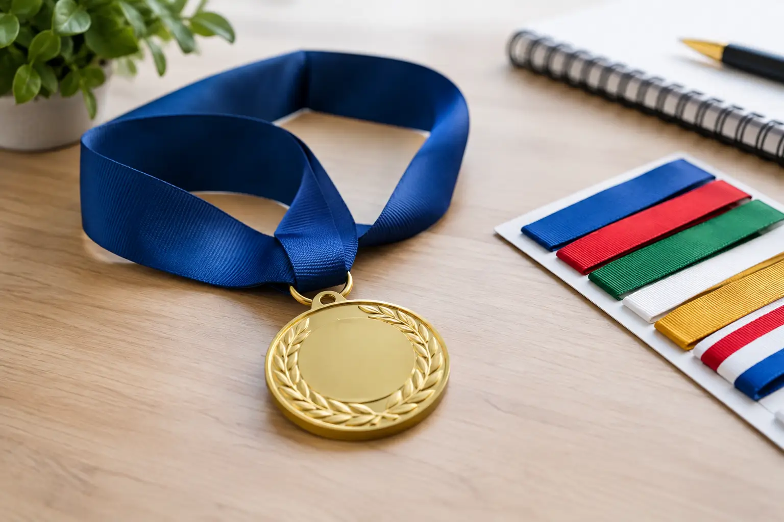
A medal can be flawless on the front and become difficult to read on the back if the font isn't suited to the available surface. Choosing a font for a medal requires looking at much more than letter style: the medal's diameter, the amount of text, the engraving method, the material's contrast and the intended use all matter. Good typography makes it possible to recognize a name, a date or a category at a glance, even years after the event.
For a sports league, a school, a municipality or an organizing committee, this decision also has a direct effect on how the honour is perceived. Clean, balanced text gives every medal a professional finish. Conversely, a font that is too decorative, too thin or too small can reduce legibility, even when the message itself is relevant.
Choosing a medal font based on actual space
The first constraint is straightforward: a medal does not offer the same marking area as a plaque or a trophy. On a small disc, every character takes up space. It is therefore best to establish a hierarchy of information before selecting a typeface. The participant's name, the discipline and the year should not all be treated with the same visual weight.
In most cases, the name of the event or organization can use a slightly larger size, while the category, placing or date is set in a secondary size. If a logo is engraved, it should be given a clear area so that it does not compete with the text. This layout produces a cleaner result than a back face filled with lines of equal weight.
A sans-serif font, such as a typeface in the style of Arial, Helvetica or Univers, is often a safe choice for small characters. Its forms are straightforward, its strokes are consistent and the letters remain recognizable when engraved at a small scale. It is particularly well suited to participation medals, annual tournaments and corporate recognition programs.
Serif fonts can also work very well, especially on a larger medal or for a more formal presentation. They bring a classic presence that suits a gala, an academic award or a commemoration. However, typefaces with overly tight details should be avoided: at small sizes, delicate serifs can lose their definition.
The most useful rule is to prioritize legibility over originality. A font that looks striking on screen is not necessarily suited to engraving on metal. The text must remain easy to read at a normal distance and under varying lighting conditions.
The marking process influences typographic choices
Typography must always be evaluated alongside the chosen production process. Laser engraving can reproduce precise text and fine details on a variety of materials, but it still has to respect the physical limits of the surface and the contrast available. On a metal medal, the depth, the colour of the coating and the angle of the light can all affect how the lettering is perceived.
CNC engraving works well for certain jobs requiring notable depth or relief. In this context, a font with sufficiently open strokes allows the finished product to maintain clean edges. Very thin, condensed, or script fonts require extra care, as their narrow sections may appear less sharp once produced.
When text is printed or incorporated into a colour insert, the design possibilities are broader. That said, it's still best to avoid mixing too many styles. A medal with a dynamic visual can feature simple, solid text, which creates an effective balance. Conversely, a highly detailed logo paired with a decorative font and multiple visual effects can start to look cluttered.
Contrast also deserves particular attention. Dark lettering on a light background is generally easy to read, whereas tone-on-tone engraving may call for wider characters. For a gold, silver, or bronze medal, it's worth verifying how the text looks with a production preview rather than relying solely on the digital mock-up.
Matching the Style to the Event and the Audience
The best choice also depends on the message the medal is meant to convey. A minor hockey tournament, a charity run, and an employee recognition ceremony don't call for the same tone. The font contributes to that consistency, without needing to become the main design element.
For sports and youth activities, a bolder sans-serif typeface often produces an energetic, easy-to-read result. Slightly rounded letters can suit a recreational or school-based activity. For a regional championship or a higher-level competition, a more structured, upright, and assertive font better supports the official nature of the presentation.
In a corporate, association, or municipal context, understated fonts inspire confidence and pair easily with an institutional logo. A geometric or classic font will showcase a service award, a work anniversary, or a volunteer distinction. If the organization already has graphic standards in place, those should guide the choice in order to maintain a consistent brand image across medals, plaques, certificates, and promotional apparel.
Script fonts should be reserved for short inscriptions or more personal projects. They can add a warm touch to a commemorative medal, an engraved gift, or an award presented to a specific individual. However, they become less effective for a long list of names, a complex category, or a small surface area. In such cases, a script font might be used for a word like "Congratulations," while the essential information remains in a simple font.
Avoiding Mistakes That Make a Medal Hard to Read
The first mistake is trying to include everything. A medal is not a poster: it should carry the information that gives meaning to the recognition. If the text exceeds three or four short lines, it's better to reduce the content, choose a larger medal format, or move some of the information to a printed ribbon, a plaque, or a complementary certificate.
The second mistake is using too many fonts. Two styles are generally enough: a main font for the title or distinction, then a secondary font for the details. Using three or four typefaces rarely creates a useful hierarchy and can undermine visual unity.
The third mistake is compressing letters too tightly to fit an overly long text. Spacing between characters and lines is essential for readability. A slightly smaller but well-spaced font is often more effective than a narrow font set edge to edge.
Finally, accents, capitalization, proper names and dates should all be carefully reviewed before production. A personalized medal is a lasting object. A spelling mistake or incorrect date is immediately noticeable and may require an entire order to be redone.
Preparing Text That Is Ready for Engraving
Before submitting your request, prepare the final content exactly as it should appear on each medal. Clearly indicate any variable elements, such as the recipient's name, category or ranking. For a group order, an organized spreadsheet reduces the risk of mixing up names and results.
It is also helpful to specify the type of event, the number of medals, the desired diameter, the presentation date and whether a logo is included. These details make it possible to suggest a font and layout that are realistic for the chosen engraving process. A proof can confirm the balance between the text, margins and graphic elements before production begins.
At Mr Trophée, personalization can be tailored to the medal's format, material and desired level of detail, whether for a sports, academic, corporate or commemorative presentation. The right typographic choice does not try to steal the spotlight: it lets the message, the name and the recognition remain perfectly visible.
You may also like
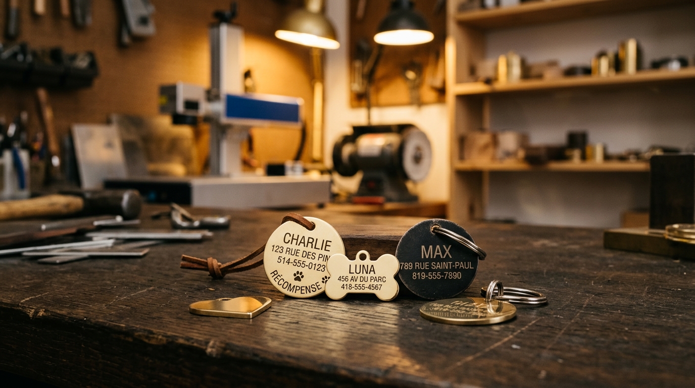
How to Choose the Right ID Tag for Your Dog or Cat
Shape, colour, engraved text, attachment: a simple guide to picking a durable, readable ID tag for your pet.
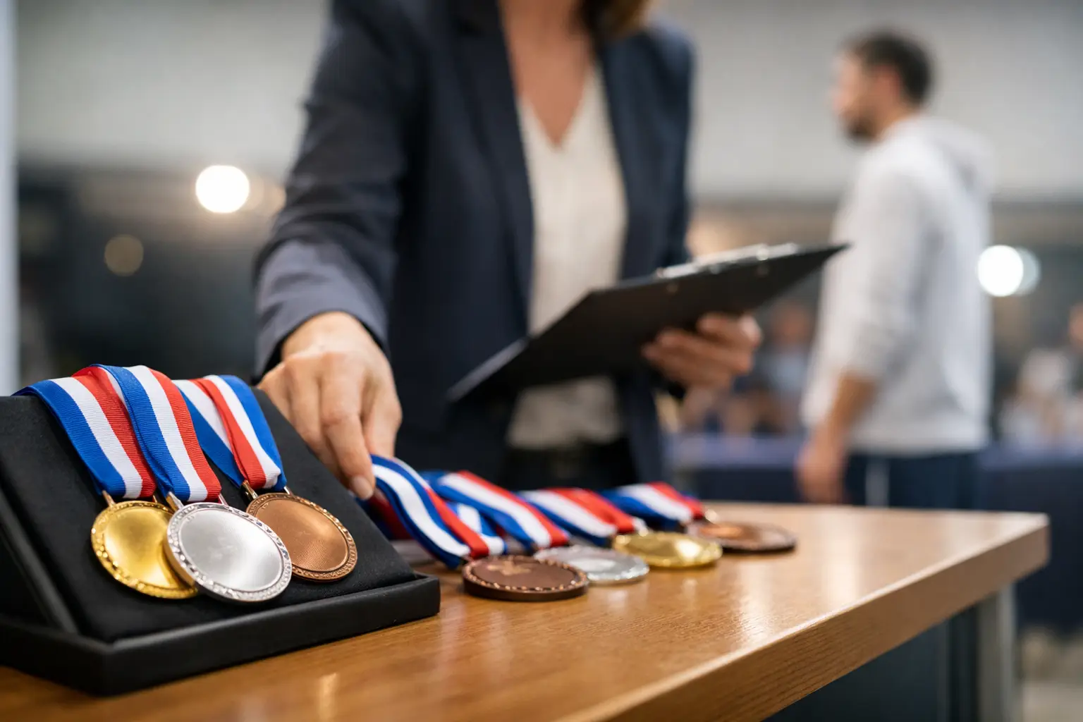
Organizing a Medal Presentation Without Missing Anyone
Organizing a medal ceremony with custom medals, a precise run of show, and reliable engraving to honour every participant in front of their team and parents.
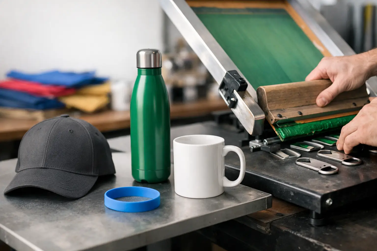
Promotional Object Screen Printing: Making the Right Choice
Screen printing on promotional items: choose durable materials, inks and designs for your teams, events and campaigns in Quebec and Canada.