

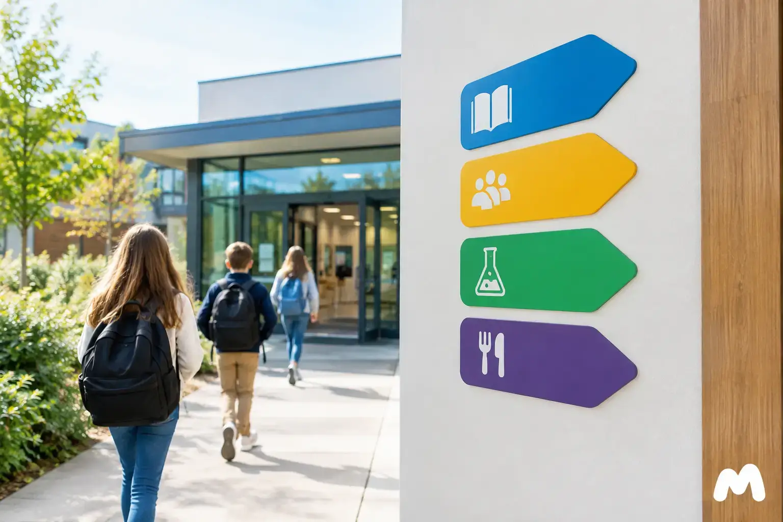
At the start of the school year, a school cannot rely solely on front-desk explanations to guide hundreds of students, parents, and visitors. In this school signage case study, the project stemmed from a very practical need: making navigation easier in a building that had been expanded multiple times, without cluttering the walls with a mismatched assortment of signs.
The facility welcomed students from preschool through high school, as well as community organizations using certain rooms in the evening. From the entrances to the administrative offices, and from the gymnasium to the emergency exits, messages needed to be legible, consistent, and tailored to audiences unfamiliar with the premises.
The challenge: guide without cluttering the school
Over the years, signs had been added on an ad hoc basis: a laminated sheet on a door, a printed arrow near a hallway, a temporary flyer marking the main office. While each piece might have been useful on its own, together they no longer provided a clear path. Visitors frequently asked for directions, and staff had to repeat the same instructions, especially during registration, parent-teacher nights, and sporting events.
The project was therefore not just about manufacturing signs. It required establishing a logical signage system that helps people make the right decision at the right spot: at the entrance, at a hallway intersection, in front of a door, or near a staircase.
The school team also wanted to maintain a welcoming environment. Institutional signage needs to look professional, but it doesn't have to feel cold. The school's colours, logo, and a readable font could be tastefully integrated without compromising the clarity of the information.
School signage case study: starting from actual foot traffic
Before choosing materials, the most valuable step is to look at how people actually move through the building. In this school signage case study, the main routes were mapped out: bus drop-offs, visitor entrances, daycare access, traffic flow to the gym, and access to specialized classrooms. This step prevents ordering attractive signs that don't address the spots where people actually get confused.
Decision points were then grouped by function. Exterior signs needed to identify entryways and direct visitors. Indoors, directional signage needed to guide people toward specific wings. Door plaques were meant to confirm that a person had reached the right room. Finally, safety messaging and technical markings required a distinct, consistent presentation.
A hierarchy that reduces questions
The school opted for a simple system. General information, such as "Main Office", "Gymnasium", or "Library", is visible from the main hallways. Directional arrows are placed before intersections rather than after. Room numbers are uniform and installed at a consistent height on every door.
This hierarchy avoids a common problem: trying to pack all the information onto a single sign. A directional sign doesn’t need to display the main office hours, school regulations, and every staff member’s name. Its role is to guide. Detailed information can be placed near the department in question or on an administrative notice board designated for this purpose.
The use of pictograms was also considered for washrooms, elevators, stairs, the infirmary, and exits. They are particularly useful for young students, non-native speakers, and anyone needing to find their way quickly. However, a pictogram doesn’t always replace clear wording: the two often work best together.
Materials chosen based on location
The choice of material determines the lifespan, maintenance, and appearance of the signs. School signage endures heavy wear and tear: backpacks rubbing against walls, frequent cleaning, hallway bumps, room reassignments, and evening activities. The material should match its function rather than being chosen solely on upfront cost.
For door plates and permanent identification, engraved Lamicoid is a practical option. It provides crisp contrast, stands up well to daily use, and allows for plates featuring text, numbers, pictograms, or department names. CNC or laser engraving creates a durable marking that doesn’t rely on a surface-applied sticker.
Indoor directional signs can be made from rigid plastic, acrylic, or aluminium, depending on the desired look and the building's constraints. Acrylic works well for a more contemporary look, particularly in the entryway or near the main office. Aluminium is well-suited for high-traffic or exposed areas and certain outdoor uses. For temporary or adaptable signage, printed vinyl can be an effective solution, provided you plan for replacement as it undergoes wear and tear.
The trade-off often comes down to flexibility versus permanence. An engraved plate is ideal for a room whose use rarely changes. For a shared room or an office likely to be reassigned, a system with interchangeable inserts can reduce costs when future changes arise.
Consistent production, from file to installation
Once the plan was approved, the school consolidated its requirements into a single structured order: room plates, directional signs, office identification, restricted area signage, and entryway elements. This approach makes it easier to maintain consistency in colours, dimensions, and fonts.
Graphic design must be planned with manufacturing in mind. A font that is too thin, a low-contrast colour, or an overly detailed logo may look great on a screen, but lose legibility on a small plate. A signage specialist can adapt the layout to the selected process, whether it’s laser engraving, CNC engraving, printing, or screen printing.
At Mr. Trophy, this step can bring together graphic design, material selection, and item customization within a single project. For a school, the benefit goes beyond simply ordering signs: it means getting a cohesive suite of products, including door signs, locker tags, commemorative plaques, or recognition awards for school events as needed.
Planning for Changes Before Ordering
Schools evolve. A room might become a resource classroom, an office might change occupants, and a new wing might open. That’s why signage project files must retain the text, dimensions, colours, and production files. When an addition is needed, it becomes much easier to reproduce a sign that seamlessly matches those already installed.
It is also wise to order a few extra generic items, such as “Meeting Room” or “Staff Only” signs, or directional arrows. While this doesn’t replace comprehensive planning, it can save the day when a quick change is needed.
Essential Checks Not to Overlook
Effective signage must also comply with applicable building regulations. Requirements may vary depending on the type of facility, accessibility standards, municipal bylaws, fire prevention guidelines, and school service centre policies. Information regarding exits, evacuation routes, safety equipment, or accessible spaces must be validated by the responsible parties prior to production.
Readability deserves the same level of attention. Contrast, font size, lighting, and viewing distance directly influence a sign’s effectiveness. Even a perfectly engraved plaque is of little use if it’s hidden behind an open door or installed where no one ever looks.
For this project, the best choice wasn’t the biggest sign. It was giving each marker a clear purpose, a suitable material, and a logical place along the path. Well-planned signage helps visitors feel welcome, frees up staff time, and gives the school an image worthy of its community.
You may also like

Preparing a School Recognition Tournament
Preparing a school recognition tournament with custom trophies, medals, and plaques, ordered on time for a polished, successful awards presentation.

School Merit Awards: A Guide to Properly Recognizing Your Students
Merit gala, end-of-year ceremony or excellence awards: here is how to choose the trophies, medals and plaques that truly celebrate your students' achievements.

End-of-Year School Trophies: How to Celebrate Student Achievements in Style
Awards night, graduation or year-end party: here is how to choose trophies, medals and plaques that truly leave a mark on students and their parents. A practical guide for schools, teachers and parent committees.