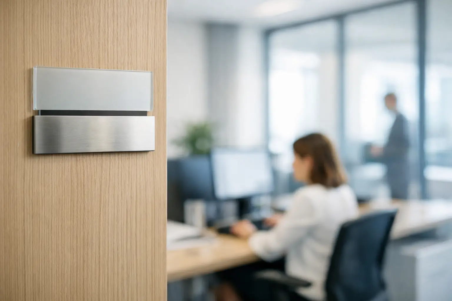
An unlabelled door wastes time, creates hesitation, and can give the impression of poor planning. A door nameplate for an office takes care of that detail precisely: it identifies the right person, the right department, or the right role, while remaining consistent with the organization's image. In a school, a town hall, a business, an association, or a sports centre, it directly supports visitor wayfinding and the day-to-day comfort of staff.
The right choice isn't just about colour or font. Material, mounting method, displayed information, how often updates are needed, and usage conditions all determine how long the sign will last and how well it will perform. Here's how to define door signage that suits your space.
What is an office door nameplate for?
A door nameplate has one straightforward purpose: helping people quickly find the right contact or space. That said, its use varies depending on the setting. In administrative offices, it might display a name, a title, and a department. In a school, it identifies an administration office, a secretary's office, a meeting room, or a utility room. In a professional practice, it often needs to present clear information while maintaining a clean, polished image.
Signage can also address operational needs. Labels such as "Reception," "Human Resources," "Accounting," or "Training Room" help cut down on unnecessary interruptions. For sites open to the public, they allow visitors to find their way around without constantly having to ask staff for directions.
A well-designed nameplate also supports visual consistency. A logo, institutional colours, and legible typography tie the physical spaces back to your organization's identity. This is especially useful when multiple doors, floors, or buildings need to be identified in a uniform way.
Define the content before choosing the material
Before selecting a material, start by deciding what the nameplate needs to say. This step prevents formats that are too small, cluttered text, or orders that need to be redone just weeks later.
For an office assigned to one person, a name and title are often enough. Adding the department may make sense in a large organization, but becomes unnecessary if the hallway is already marked by zone. For a shared room or space, focus on its function: "Management," "Archives," "Medical Room," "Room 204," or "Staff Only."
Legibility comes first. Dense text, low contrast, or an oversized logo all reduce the usefulness of the sign, even if the overall design looks polished. Reading distance matters too. A nameplate viewed from a hallway needs larger characters than a label placed right beside a reception desk.
Finally, consider how often changes will be needed. Employee names change more frequently than room labels. If your offices are reassigned on a regular basis, a nameplate with a swappable insert or a name window holder may be more cost-effective than permanent engraving. On the other hand, a stable designation warrants durable, clean-cut marking.
Materials suited to interior signage
The choice of material depends on the style you're looking for, your budget, how often updates are needed, and the environment. There is no single ideal material for every project.
Engraved Lamicoid: practical and precise
Lamicoid is a common solution for door plates, technical labels, and interior signage. This multi-layer plastic reveals a contrasting colour when engraved. For example, engraving a black surface exposes white text underneath, ensuring clear, easy readability.
This material is well suited to organizations looking for durable, functional signage available in a variety of colour combinations. It works well for office numbers, department names, pictograms, and technical markers. CNC engraving produces consistent marking, even for large runs.
Its look tends to be more utilitarian than decorative. For an upscale firm or a boardroom, a metal support or a more refined material may better suit the atmosphere of the space.
Aluminum and metal: an institutional finish
An aluminum or metal plate conveys a structured, professional impression. It is particularly well suited to lobbies, executive offices, municipal spaces, healthcare facilities, or organizations seeking a more formal presentation.
Laser engraving offers excellent precision for text, numbers, and logos. Depending on the finish you choose, you can opt for a brushed, satin, or higher-contrast effect. Metal holds up well with regular use, but careful attention should be paid to the mounting system to preserve the alignment and appearance of the wall or door.
Acrylic and plexiglass: contemporary and customizable
Acrylic makes it possible to create signage that is lightweight, modern, and visually expressive. Whether clear, frosted, coloured, or printed, it offers multiple options for incorporating a graphic identity. It can be used on its own or combined with a printed backing, standoffs, or a second panel to add depth.
This option works well for modern offices, creative spaces, meeting rooms, and reception areas. It does require careful design, however: overly strong reflections or poorly used transparency can hinder readability. In a high-traffic area, choose a thickness and mounting method suited to the wear and tear of daily use.
Customizing an office door sign without overcrowding it
Customizing does not mean filling every centimetre. An effective office door sign presents information in a clear hierarchy. The name of the person or space should be read first, followed by the title or department. The logo supports the organization's identity without overshadowing the message.
Your graphic standards are a good starting point. Use company colours thoughtfully, maintaining sufficient contrast between the background and the lettering. Dark blue on a black background, for instance, may be consistent with a visual identity while still being difficult to read in a dimly lit hallway.
Pictograms can be helpful when they convey immediate information: accessibility, washrooms, first aid rooms, change rooms, or maintenance areas. For individual offices, they are rarely necessary. In that case, a clean, understated design is often more lasting, especially when roles or services change.
A signage and engraving specialist can prepare a cohesive visual using your logo, dimensions, and installation requirements. At Mr. Trophy, customization can combine graphic design, laser engraving, CNC engraving, and printing depending on the material chosen.
Mounting: a detail that changes everything
The best plaque loses its value if it peels off, warps, or leaves marks that are difficult to remove. The choice of mounting method depends on the door, its surface finish, and whether the plaque may need to be relocated.
Double-sided adhesive works well for lightweight plaques applied to a clean, smooth, and stable surface. It gives a discreet result, but is less suited to textured doors, humid environments, or plaques that need to be replaced regularly. Before installation, the surface must be degreased and completely dry.
Screws and standoffs provide a more durable hold and a more prominent look. They work well for acrylic, metal, or plaques mounted on a wall beside the door. However, this option requires drilling into the surface, which is not always possible in leased spaces or on certain fire doors.
Slide-in or insert systems are a smart choice for positions that change over time. They allow a name or title to be updated without replacing the entire plaque. The upfront cost may be higher, but they reduce expenses and turnaround times in the long run for larger organizations.
Planning a consistent signage system across your entire facility
Ordering plaques one at a time may seem convenient at first, but it quickly leads to inconsistencies in size, colour, and style. For an office project, it is better to establish a common template: standard dimensions, logo placement, typeface, colour coding by department, and mounting method.
This standardization makes future orders straightforward. When a new employee joins or a room changes purpose, you simply follow the existing template. It also simplifies the management of buildings with multiple floors, annexes, or locations.
Consider the associated elements as well: directional plaques, room numbers, wall signage, locker labels, safety markers, and name badges. A consistent visual identity makes the overall environment clearer for visitors and staff alike.
Before finalizing your order, take the time to verify the spelling of names, accents, job titles, and room numbering. A plaque is a small medium, but it is seen every day. When it is easy to read, properly mounted, and made for your actual needs, it lets your spaces communicate clearly from the moment someone reaches the door.
You may also like

Choosing the Right Font for Your Medal
Choose a font for your medal: adapt the typography to the space, the engraving process, and the event for a legible and lasting everyday marking.
How to Choose the Right Custom Keychains for Your Association
Custom keychains for associations, durable and well-crafted, to thank volunteers, identify your members, and support your activities.

Soccer Tournament Trophy Guide: How to Choose the Right One
Soccer tournament trophy guide: choose custom cups, medals, and plaques based on your event's categories, budget, and timeline.