An unreadable room panel, a door without visual contrast, or digital-only wayfinding can turn an ordinary trip into an obstacle. The 2026 accessible signage trends address this reality with solutions that are more legible, tactile, consistent, and suited to spaces used by everyone. For a school, a municipality, a clinic, a sports centre, or a business, accessibility is no longer about adding a few pictograms at the end of a project. It shapes material choices, information hierarchy, manufacturing methods, and installation.
Accessibility becomes a design criterion
Accessible signage is designed to help as many people as possible locate a space, understand instructions, and move around independently. It is intended particularly for people with visual impairments, reduced mobility, reading difficulties, or cognitive challenges, but it also benefits visitors in a hurry, seniors, parents with strollers, and people who are unfamiliar with a building.
In 2026, organizations are looking less for isolated panels than for complete systems. A room number, a service identifier, corridor directions, safety instructions, and exterior signage should all follow the same logic. A person who recognizes the visual codes at the entrance should be able to follow them all the way to their destination without having to ask for directions.
This approach requires upfront planning. It means identifying the most-used routes, the points where visitors hesitate, the priority information, and the site's constraints. In a school, the need may be to quickly distinguish offices, washrooms, the gymnasium, and exits. In an office building, it may mean identifying floors, rooms, and common areas while respecting the organization's brand identity.
The main accessible signage trends in 2026
Sharper contrast, not just more decorative contrast
Contrast remains one of the most useful elements for reading at a distance. In practice, light text on a very pale background, or dark text on a dark surface, creates problems even when the typography looks elegant. Projects in 2026 favour clean combinations between the background, letters, numbers, and pictograms.
Contrast also applies to finish. A highly glossy panel can reflect lighting and reduce legibility. Matte or low-glare materials are often more appropriate in corridors, glazed entryways, and brightly lit areas. Engravable plastics like Lamicoid make it possible to create durable contrasted lettering, while acrylic, painted metal, or wood may be suitable depending on the environment and the desired result.
This does not mean setting aside all brand colours. An organization can keep its institutional colours by reserving them for borders, secondary areas, or graphic elements, then choose a higher-contrast reading surface for essential information.
Tactile elements, braille, and raised lettering are gaining ground
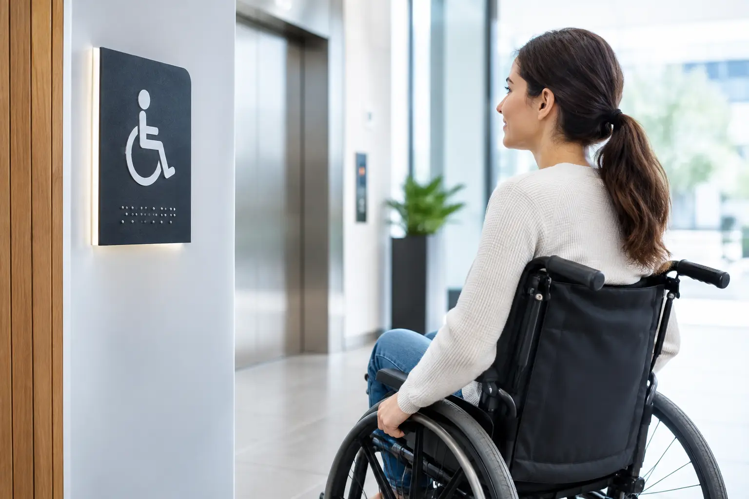
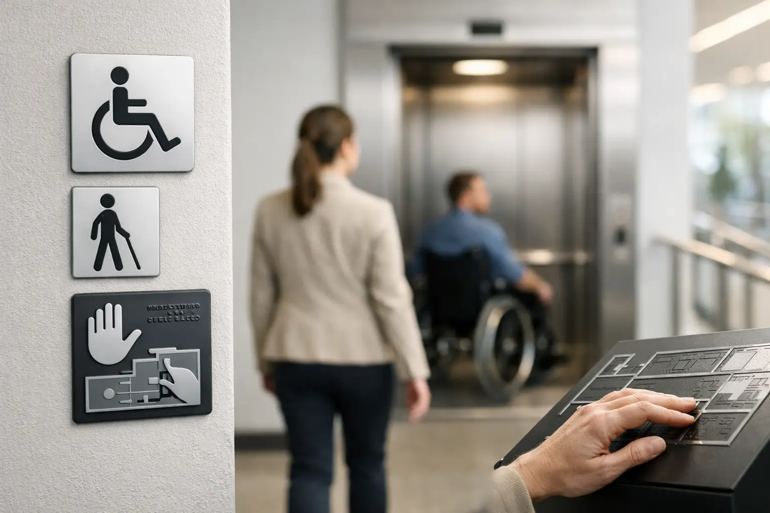
Tactile signs are no longer limited to washrooms and exits. They are increasingly found on door numbers, meeting rooms, floors, care spaces and service areas. Raised characters and braille provide a direct reference point for people who read by touch.
Craftsmanship matters a great deal. A raised surface must be perceptible without presenting sharp edges, and braille must be positioned with precision. CNC engraving, cutting and the assembly of applied characters make it possible to produce signs adapted to the required format. The choice depends on the material, indoor or outdoor use, order volume and the level of customization needed.
Tactile information does not replace good visual readability. An effective door sign generally combines clear text, strong contrast, sufficiently large characters and, where necessary, tactile information. Each layer of information serves a different purpose.
Simple and consistent pictograms
Pictograms are particularly useful in locations frequented by visitors of varying languages, ages and reading levels. In 2026, the trend is toward direct, recognizable symbols that are repeated uniformly. A different pictogram used to identify the same function from one floor to another creates confusion, even if it is graphically appealing.
Bilingual organizations also benefit from reducing text overload. French and English remain essential for many Quebec and Canadian organizations, but a well-chosen pictogram can support both languages without cluttering the sign. That said, the solution must be validated according to the message. An emergency direction, a safety rule or a specific instruction should never rely on an ambiguous symbol.
More inclusive signage in temporary spaces
Events, sporting competitions, recognition ceremonies and open houses often require signage installed for just a few hours or days. For a long time, such displays were put together hastily, with inconsistent formats and uneven readability.
The trend is toward preparing reusable sets: directional signs, table plaques, area identifiers, sponsor displays, station numbers and name badges. For a tournament, a school or an association, this reduces setup time and gives participants consistent points of reference. Removable stands must remain stable, be placed away from high-traffic areas and be readable at the appropriate height.
Badges, name tags and promotional clothing can also contribute to wayfinding. Identifiable staff help visitors, especially in complex venues. High-contrast printing or screen printing makes this recognition easier from a distance.
Digital complements physical signage
QR codes, welcome screens and digital directories are part of current projects, but they should not become the only gateway to information. A visitor may not have a phone, may not want to use it, or may have difficulty reading a screen in certain conditions. Essential information — directions, numbers, washrooms, exits, welcome desk — must remain accessible on site.
Digital tools are useful for variable information: event programs, schedules, detailed maps, staff directories or updated instructions. In this case, the physical sign serves as a clear starting point. It indicates what is nearby and simply explains what the digital resource offers in addition.
This complementary approach is particularly relevant for municipalities and campuses. A durable general map can be engraved or printed, while a QR code provides access to a detailed version, an interactive map or seasonal information.
Durability is becoming a practical requirement
Accessible signage that peels, fades or loses its contrast quickly stops fulfilling its purpose. Buyers are therefore paying closer attention to material durability, marking methods and installation conditions. An interior sign in a quiet corridor does not have the same requirements as an outdoor plaque exposed to sun, frost, salt and frequent handling.
Laser engraving is suited to many custom applications and produces precise marking on a variety of materials. CNC engraving offers useful possibilities for thicker plaques, raised lettering and certain durable signage projects. Printing and screen printing may be appropriate for series, colour coding or more complex visuals. The right process depends on the material, quantity, expected finish and intended lifespan.
Choosing a durable solution may cost more upfront, but it avoids repeated replacements and maintains a professional appearance. For organizations that regularly order door plates, nameplates, awards or signs, it is also helpful to keep graphic files, colour references and standardized dimensions on hand.
How to prepare an accessible signage project
Before requesting a quote, gather the information that will directly affect production: the list of locations to be identified, approximate dimensions, texts in French and English, logos, colours, site photos and installation constraints. Also specify whether the plaques need to include braille, raised elements, pictograms or interchangeable components.
A site visit remains very useful for larger wayfinding projects. It allows you to assess approach angles, lighting, door heights, visual obstacles and available surfaces. A perfectly designed sign on screen can be difficult to spot once installed behind an open door or near a very bright window.
Finally, ask for a production logic that can evolve with your organization. Schools add rooms, businesses change staff, and municipalities reorganize their services. Consistent templates and readily available materials make future additions easier, without creating a mismatched mix of styles.
Good signage doesn't demand attention — it provides the right reference at the right moment. By preparing clear information and choosing engraving, printing, or fabrication techniques suited to the space, your next sign can serve you well for years to come, with precision and consideration for every visitor.
You may also like

Preparing a School Recognition Tournament
Preparing a school recognition tournament with custom trophies, medals, and plaques, ordered on time for a polished, successful awards presentation.
Accessible Signage Guide for Buildings
Accessible wayfinding guide for buildings: clear, high-contrast and durable signage for schools, businesses and municipalities every day.

2027 Corporate Gifting Trends to Watch
2027 corporate gifting trends prioritize practicality, sustainability, and personalization. Concrete ideas for your teams and successful events.